

You're probably dealing with one of two versions of the same headache. Either the weekly project summary is so vague that every stakeholder meeting turns into a live interrogation, or it's so dense that nobody reads it until something goes wrong.
That problem gets worse in software delivery. Modern teams aren't just tracking features and deadlines. They're tracking dependencies, rollout risk, vendor coordination, compliance work, and often AI integration choices that affect cost, data handling, and long-term maintainability. A good project summary template isn't just documentation. It's an operating tool for decision-making.
The best summaries do one job well. They help busy people understand the state of a project in a few minutes, decide what needs attention, and move forward without opening six other documents.
Why Your Project Summary Isn't Working
Monday morning. The steering committee has ten minutes for your update, and the first question lands before you finish the second sentence: “Are we on track or not?” That moment usually exposes the underlying problem. The summary exists, but it is not giving anyone a clear read on the project.
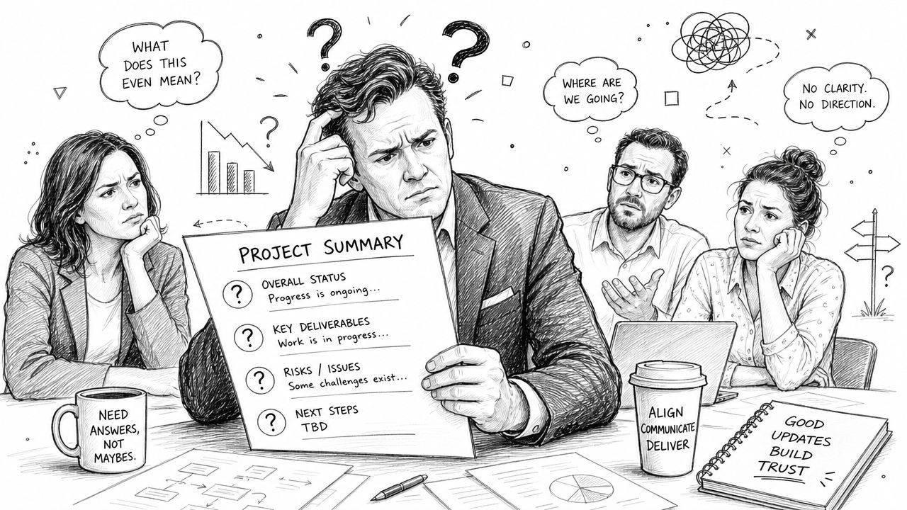
Weak summaries fail in predictable ways. Some are stuffed with task updates, meeting notes, and copied Jira language. Others are so stripped down that a sponsor cannot tell whether the project is stable, slipping, or waiting on a decision. In both cases, the document stops serving as a management tool and starts creating extra work.
I see this often on software programs with multiple workstreams. A team reports features shipped, tickets closed, and workshops completed, yet senior stakeholders still do not know what changed, what risk increased, or what approval is needed. Activity is visible. Progress is not.
Most summaries confuse motion with control
A project summary should help a reader get oriented fast. That means clear ownership, current status, material changes since the last update, active risks, and the next decision or action. If the reader has to hunt for the point, the summary is carrying too much raw input and not enough judgment.
Common failure patterns show up quickly:
- Task noise replaces decision-ready reporting: Sprint notes and ticket names crowd out what leadership needs to know.
- Status labels hide uncertainty: “Green” appears at the top while unresolved dependencies sit three paragraphs down.
- Blockers show up too late: Teams wait until a delay is certain before stating that integration, compliance, or vendor work is off plan.
- One version goes to everyone: The same summary gets sent to engineering, finance, delivery leadership, and the client sponsor, even though each group reads for different decisions.
A simple test works well. After one pass, a stakeholder should be able to answer four questions: What is the project trying to achieve? Where does it stand now? What could derail it? What needs attention this week?
The summary should steer conversations
Good summaries reduce meeting time because they frame the right discussion before the call starts. They also create accountability. If a risk is real, it appears plainly. If a date moved, the reason is stated. If leadership input is needed, the ask is explicit.
That becomes more important in software and AI delivery, where the moving parts change faster than the reporting cycle. Model behavior, data quality, prompt changes, infrastructure costs, rollout controls, and audit requirements can shift the health of a project without changing the visible feature list. Teams that treat the summary as a living operating document usually handle that complexity better, especially when reporting is tied to broader modern IT project management processes.
Modern tooling helps here too. The best teams do not use the summary as a static afterthought written on Friday afternoon. They build it from current project signals, then shape it for the audience. That keeps the document short, current, and useful enough to drive decisions instead of just recording them.
A project summary should lower uncertainty. If it forces people to open five other documents before they understand the situation, it is failing.
The Anatomy of an Effective Project Summary
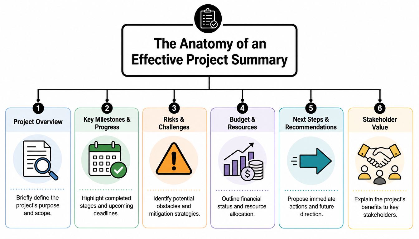
A useful project summary follows a clear operating model. It gives a reader enough context to judge delivery health, enough evidence to trust the update, and enough specificity to act. In software and AI projects, that matters because status can change before the next formal checkpoint. A summary has to keep up with the work, not trail behind it.
The required fields
Every summary needs a few anchor points so a stakeholder can understand the update in seconds. Include the project name, project ID, project phase, reporting date, and target launch or delivery date. Then add the core reporting sections: goals, current scope, milestone status, risks, and budget or forecast.
For modern delivery teams, especially those running software, data, or AI initiatives, I also recommend two fields that older templates often miss: decision needed and signal source. Decision needed tells leadership what requires action now. Signal source shows where the update came from, such as sprint outcomes, issue tracking, model evaluation results, burn data, or vendor dependencies. That keeps the summary grounded in current evidence instead of hindsight.
A practical structure looks like this:
| Component | What it should answer | Why it matters |
|---|---|---|
| Project overview | What is this project and why does it exist? | Gives immediate context |
| Scope and objectives | What are we delivering, and what counts as success? | Prevents drift |
| Status snapshot | What has changed since the last update? | Supports fast decisions |
| Risks and blockers | What could stop progress? | Surfaces action early |
| Milestones and dates | What's been hit, and what's next? | Creates accountability |
| Budget snapshot | Are spend and forecast in line? | Anchors operational reality |
The one-page rule is useful, but only if it forces clarity. If a project has serious delivery risk, hiding detail to stay on one page creates more confusion than it removes. In those cases, keep the summary tight and attach a deeper appendix or dashboard.
The three status updates that matter
Strong summaries separate progress into three plain categories: done, in progress, and blocked. The discipline is simple. Report outcomes, not activity.
- What is done should state a completed result. “Identity provider integration approved in staging” is clear. “Worked on auth” is vague.
- What is in progress should show the current effort and its intended outcome. Name the workstream, the near-term target, and any dependency that could change timing.
- What is blocked should identify a real constraint, such as an unresolved product decision, missing data access, procurement delay, security review, or team capacity issue.
Weak summaries typically break down because they mix effort with progress, or they hide blockers inside soft language. Senior stakeholders can work with bad news. They cannot work with ambiguity.
A summary earns trust when it names friction early, before schedule slippage or cost growth makes the issue impossible to ignore.
For AI projects, this section often needs one more layer of precision. “Model in testing” says very little. “Model passes latency target but still misses retrieval quality threshold for support queries” gives the team and sponsor something concrete to discuss. The same principle applies to software rollouts. “Release prep underway” is less useful than “release candidate is ready, but production launch depends on final penetration test sign-off.”
Budget, visuals, and stakeholder value
Budget belongs in the summary because scope, timing, and cost move together. If timeline pressure is rising, forecast usually changes. If scope expands, staffing or infrastructure costs usually follow. A budget snapshot does not need a full finance report, but it should show current spend position, forecast confidence, and any decision that could change cost.
Visuals help when they compress complexity. A milestone trend, burn chart, release readiness score, or risk heatmap can explain in seconds what three paragraphs struggle to say. The trade-off is maintenance. If charts are stale or manually assembled from old data, they reduce trust. Good teams use connected tools to pull current delivery signals into the summary, then refine the story for the audience. That turns the summary from a static document into an active reporting surface.
Stakeholder value should be explicit too. State what the project improves, reduces, enables, or protects. Tie progress back to the business result, not just the delivery motion. On a platform migration, that may be lower hosting risk and better deployment speed. On an AI assistant rollout, it may be faster resolution time, lower support load, or stronger compliance controls.
That is the full anatomy. Clear frame, current evidence, visible risk, and a direct link between delivery status and business value.
A Step-by-Step Guide to Crafting Your Summary
Writing a strong summary is less about filling in a form and more about controlling the narrative without distorting the facts. The process should feel disciplined, especially on software projects where technical progress and business progress don't always move at the same speed.
Start with audience and evidence
Before drafting a sentence, gather the current source inputs. Pull milestone status, budget status, open risks, owner updates, unresolved decisions, and any change in scope or launch assumptions. Then decide who will read the summary first.
A delivery lead wants specificity. A department head wants operational clarity. An executive sponsor wants to know whether the project is on track, what's changed, and whether intervention is needed.
That's why a one-size-fits-all draft usually falls flat. You don't need different facts for different readers. You need different emphasis.
Build the narrative around outcomes
Once the inputs are collected, shape the update around what changed in the project, not around what the team touched. That forces discipline. It also keeps the summary from becoming a disguised activity log.
A practical draft flow often works like this:
- Lead with the objective: State the project's purpose in one or two clean sentences.
- Clarify scope boundaries: Mention what's in play right now and what isn't.
- Translate progress into outcomes: Show what has been completed in terms a non-specialist can understand.
- Name the constraint plainly: If something is stuck, say what's causing the delay and who owns the next decision.
- Close with the next move: End with the immediate milestone, recommendation, or ask.
Field note: The summary should tell the truth at the level of consequence. If a technical dependency slipped but launch risk didn't change, say that. If launch risk changed, don't hide behind technical language.
Use a methodology, not guesswork
A strong project summary template benefits from a formal structure. A full-scope methodology can include solution analysis and success evaluation metrics, along with SMART criteria for functional requirements. Teams using this fuller template approach reduced post-launch defect rates by 42% compared to ad hoc summaries, according to Stack Overflow's practical guide to writing technical specs.
That finding lines up with what experienced delivery teams already know. Vague requirements and vague summaries create the same downstream mess. When success criteria are specific, updates become easier to write and easier to verify.
Here's a useful contrast:
| Weak summary line | Better summary line |
|---|---|
| Development is progressing well | Core checkout flow is built and in validation |
| Testing is underway | QA is validating payment edge cases before release sign-off |
| We have some blockers | SSO rollout is waiting on client security approval |
| Team is making progress | Mobile onboarding screens are complete and ready for analytics tagging |
Tighten the language and add visual support
The best editing pass removes filler, repetition, and false certainty. Shorten every paragraph. Replace broad verbs with precise ones. Cut words like “ongoing” unless you explain what's happening.
Then add visuals only where they reduce reading time. A milestone bar, status chart, burn trend, or risk heat view can carry a lot of weight when the audience needs fast pattern recognition. But don't paste in a dashboard just because you have one. Every visual should answer a question the text would answer more slowly.
The final test is simple. If someone reads the summary cold, can they explain the project's current state back to you accurately? If they can't, rewrite it.
Downloadable Templates for Every Scenario
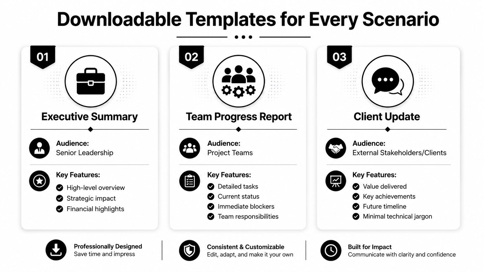
A template earns its place when it cuts reporting time and helps the next decision happen faster. In software and AI projects, that usually means one source of project truth presented in different formats for different readers, not one document forced onto every audience.
One page for fast alignment
The one-page project summary is the default format for weekly reviews, steering meetings, and cross-functional check-ins. It works best when people need a fast read on status, top risks, budget position, and the next milestone without opening three other documents.
Good one-pagers are disciplined. If everything makes the page, nothing stands out.
For teams that present updates in slides, a practical starting point is this first-slide project summary layout. It gives you a format that works in live meetings and can still be exported from modern reporting tools without much cleanup.
Executive version for strategic reviews
The executive summary template is for sponsors and senior leaders who need the project signal, not the delivery log. It should focus on business impact, spend against plan, major dependencies, material risks, and decisions that need leadership action.
This is usually where weak reporting shows up. Delivery teams paste in sprint detail because it is easy to collect, then leave out the harder judgment call: what changed, why it matters, and what decision the sponsor should make now.
For planning artifacts that help shape the project before the summary stage, teams often borrow structures from adjacent templates. A useful example is SpecStory's planning templates, which can help sharpen kickoff assumptions before those assumptions get compressed into executive reporting.
Technical version for delivery teams
The technical project summary gives engineering leads, architects, QA, and implementation stakeholders the level of detail they need. That usually includes dependency status, release sequencing, unresolved technical decisions, environment readiness, test coverage, and known blockers.
This format benefits most from built-in visuals because technical teams often need to spot change over time, not just read a status label. 74% of executives say visual aids improve decision-making speed, yet only 12% of free project summary templates include dedicated sections for charts, graphs, or dashboards according to Smartsheet's project summary templates overview. In practice, that gap pushes teams to maintain separate decks, screenshot dashboards by hand, or rebuild the same charts every reporting cycle.
A useful template set covers all three views:
| Template type | Best audience | What it prioritizes |
|---|---|---|
| One-page summary | Mixed stakeholder group | Snapshot clarity, risks, next steps |
| Executive summary | Senior leadership | Strategic impact, cost, decisions |
| Technical summary | Delivery and engineering leads | Dependencies, implementation status, blockers |
If your template forces people to build a separate chart deck every week, the template is unfinished.
The project does not change between these formats. The reporting lens does. That is exactly why strong teams treat templates as working tools tied to live project data, especially in software and AI delivery where status shifts quickly and stale summaries lose value fast.
Tailoring Your Summary for Key Industries
A project summary template for a retail app shouldn't sound like one for a grant-funded public utility. Teams get into trouble when they use generic reporting language in industries that care about very specific proof points.
Ecommerce, fintech, and healthcare
For an ecommerce platform, stakeholders usually care about what changed in the customer journey, what was released, and whether the next milestone affects merchandising, checkout, fulfillment, or personalization. The update should stay close to user impact and release readiness.
In fintech, the same summary needs a different center of gravity. Security milestones, compliance review progress, data handling decisions, and integration dependencies matter more than broad delivery language. A vague “backend work is progressing” line won't satisfy a sponsor who needs to know whether a regulated workflow is ready.
Healthcare is even less forgiving of ambiguity. Accessibility, privacy controls, workflow safety, and release coordination with internal operations usually need direct treatment in the summary. If a blocker affects patient-facing experience or protected data handling, name it clearly.
Media and public sector work
Media products often move fast and launch in cycles tied to programming, events, campaigns, or content operations. Their summaries need to show publishing readiness, performance considerations, and cross-functional coordination with design, editorial, and distribution teams.
Public sector summaries often require the most industry-specific structure. In government-funded projects under the EPA, project summary templates are required to document whether the budget exceeds $3 million and must include a Compliance History to remain eligible for grants, according to the EPA project summary template. That's a good reminder that regulated environments don't want a generic status page. They want proof that the required fields exist.
A simple adaptation pattern works well:
- Ecommerce: Focus on customer-facing release value and operational readiness.
- Fintech: Emphasize compliance, controls, and integration confidence.
- Healthcare: Highlight privacy, accessibility, and workflow safety.
- Media: Track launch coordination and experience performance.
- Public sector: Include required administrative and compliance data points.
For teams mapping stakeholder touchpoints before writing customer-facing or service-facing summaries, CartBoss customer journey template is a useful companion resource.
Supercharge Summaries with AI and Modern Tools
A delivery lead asks for a one-page status update before steering committee. The team can describe velocity, open risks, and release timing, but the project now includes LLM prompts, retrieval logic, human review steps, and usage-based costs. If those pieces live across tickets, notebooks, shared docs, and chat, the summary will lag behind the work.
That gap shows up fast in software and AI projects. A project summary is no longer just a document written at the end of the week. It works best as a live reporting layer built on top of the systems the team already uses to ship, test, and govern the product.

AI projects punish weak reporting habits
Organizations need to assess readiness before integrating AI into custom software, and data quality and management are a critical prerequisite because AI models need organized, cleaned, and validated data to perform effectively, according to Spaculus on AI integration readiness.
In practice, that readiness problem lands directly in the summary. If the team cannot trace which data source feeds a workflow, which prompt version is in production, how outputs are reviewed, or where failures are logged, the update becomes a polished guess. Leadership sees motion. They do not see whether the system is reliable, controllable, or getting more expensive.
I have seen this happen on otherwise capable teams. The engineering work was sound, but reporting broke down because no one had a single source for prompt changes, evaluation results, and operating thresholds.
What modern tooling changes
Modern tooling improves the summary by improving the underlying operating model. Instead of collecting status by hand from five separate systems, teams can pull from one managed layer that tracks the parts AI projects add to normal software delivery.
A practical setup usually includes:
- Prompt vault with versioning: Track what changed, who changed it, when it changed, and which version is live.
- Parameter controls: Manage how internal data is passed into AI workflows and document those settings clearly.
- Centralized logging: Review model behavior, errors, and edge cases in one place instead of piecing them together across tools.
- Cost tracking: Monitor cumulative usage and spot spend shifts before finance raises the issue.
- Evaluation records: Tie summaries to test results, review outcomes, and acceptance criteria rather than opinion.
For teams tightening prompt operations as part of delivery governance, these prompt engineering best practices are worth reviewing.
Better summaries come from cleaner inputs. If project data is fragmented, the summary will be fragmented too.
The strongest project summary templates now act as an interface between delivery detail and leadership decisions. For standard software projects, that means clearer status reporting. For AI projects, it also means capturing prompt changes, guardrails, review flows, and cost signals in a form stakeholders can act on.