


You clicked the right button, but the page did something else. A product card opened a side panel, the “Save” control unobtrusively changed state, and now the user is staring at a screen that doesn't match what they expected. That's the kind of small surprise that sends shoppers back to search results, support tickets, or a competitor's site.
The principle of least surprise gives teams a simple rule for those moments, build the interface, API, or AI feature so people can predict what happens next. That sounds obvious until you're shipping across desktop, mobile, internal tools, and AI-powered workflows, where each group brings different habits and expectations. A strong product team treats surprise as a design problem, a documentation problem, and an adoption problem at the same time.
That matters even more when AI is involved. If your product adds generated text, recommendations, or automated actions, the safest systems are the ones that stay transparent about what they're doing and why. Tools like a prompt vault, parameter manager, logging across integrated AIs, and cost visibility can help keep those AI behaviors consistent enough that users trust them instead of fighting them.
Why Principle of Least Surprise Matters
A shopper lands on a product page, taps Add to Cart, and gets a modal asking for a marketing preference instead. The item may still be available, but the experience now feels slippery. The user pauses, wonders whether the click worked, and often leaves before finishing the purchase.
That is the business case for predictability. When an interface behaves the way people expect, they spend less time rechecking the screen and more time completing the task. The same logic applies to support load, because fewer unexpected behaviors means fewer confused users asking what just happened.
Surprise is a retention problem, not just a UX preference
The principle of least surprise is really about reducing the gap between what a person thinks will happen and what the system does. In the late 20th century it became a named software and UX guideline, and Eric S. Raymond framed it as a general interface rule that favors composability, conventions over cleverness, and matching the user's mental model (Wikipedia on the principle of least astonishment). In plain terms, if users can guess the result before they click, they move faster and make fewer mistakes.
That predictability becomes a business lever in products that change often, especially AI-enabled ones. If a feature feels magical for one user and baffling for another, adoption tends to wobble. Teams don't need more cleverness in those moments, they need behavior that feels stable enough to trust.
Practical rule: if a change would make a first-time user stop and reread the screen, it probably deserves a clearer label, a safer default, or a better explanation.
There's also a strong product-operations angle here. Wonderment Apps' prompt management system is a useful example of the kind of administrative layer teams can use to keep AI-driven features orderly, especially when prompts, parameters, logging, and cost visibility need to stay aligned across releases. When AI behavior is managed cleanly, the product feels less erratic to both users and internal teams.
Understanding the Principle of Least Surprise
The principle of least surprise says that systems should behave the way people reasonably expect. That expectation is shaped by prior experience, so good design usually means reusing familiar patterns instead of inventing new ones just because they're novel. ESR's analysis of interface design makes the same point in practical terms, novelty increases cognitive load because users have to shift attention from the task to the interface (ESR on interface design).
A simple analogy helps. Driving on the right side of the road is not “better” because it is clever, it's better because everyone knows what to expect. The convention removes doubt, which is exactly what a predictable interface does for a checkout flow, a dashboard, or an API.
Mental models are the hidden contract
A mental model is the story users carry in their heads about how something should work. When the screen matches that story, they move naturally. When it doesn't, they slow down, test the edges, and start mistrusting the system.
This is why the principle is often restated as “match the user's mental model.” That phrasing appears in later design teaching because it makes the underlying idea easier to apply across interface types, from forms to developer tools. It also explains why the same action can feel obvious to one audience and surprising to another.
Familiar patterns beat clever surprises
Design laws like Hick's Law and Fitts's Law reinforce the same lesson, even if they come at the problem from different angles. Hick's Law reminds teams that more decision complexity slows choice, while Fitts's Law points out that target size and distance affect how easily people act. Predictable systems help on both fronts, because they reduce the mental effort needed to decide and the physical effort needed to act.
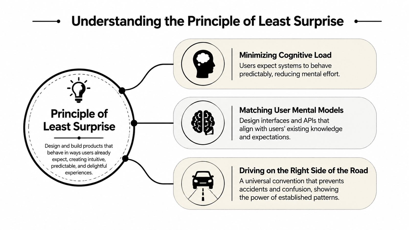
For teams building interfaces or APIs, that means the goal isn't to be plain for the sake of being plain. The goal is to be legible. If a label, gesture, or endpoint looks familiar, users can keep their attention on the task instead of decoding the product.
Predictability is not the enemy of good design, it's the condition that lets people use the good design without friction.
For readers who want a deeper adjacent guide on conventions in APIs, the internal reference on API design principles is a helpful companion.
Historical Evolution of the Principle
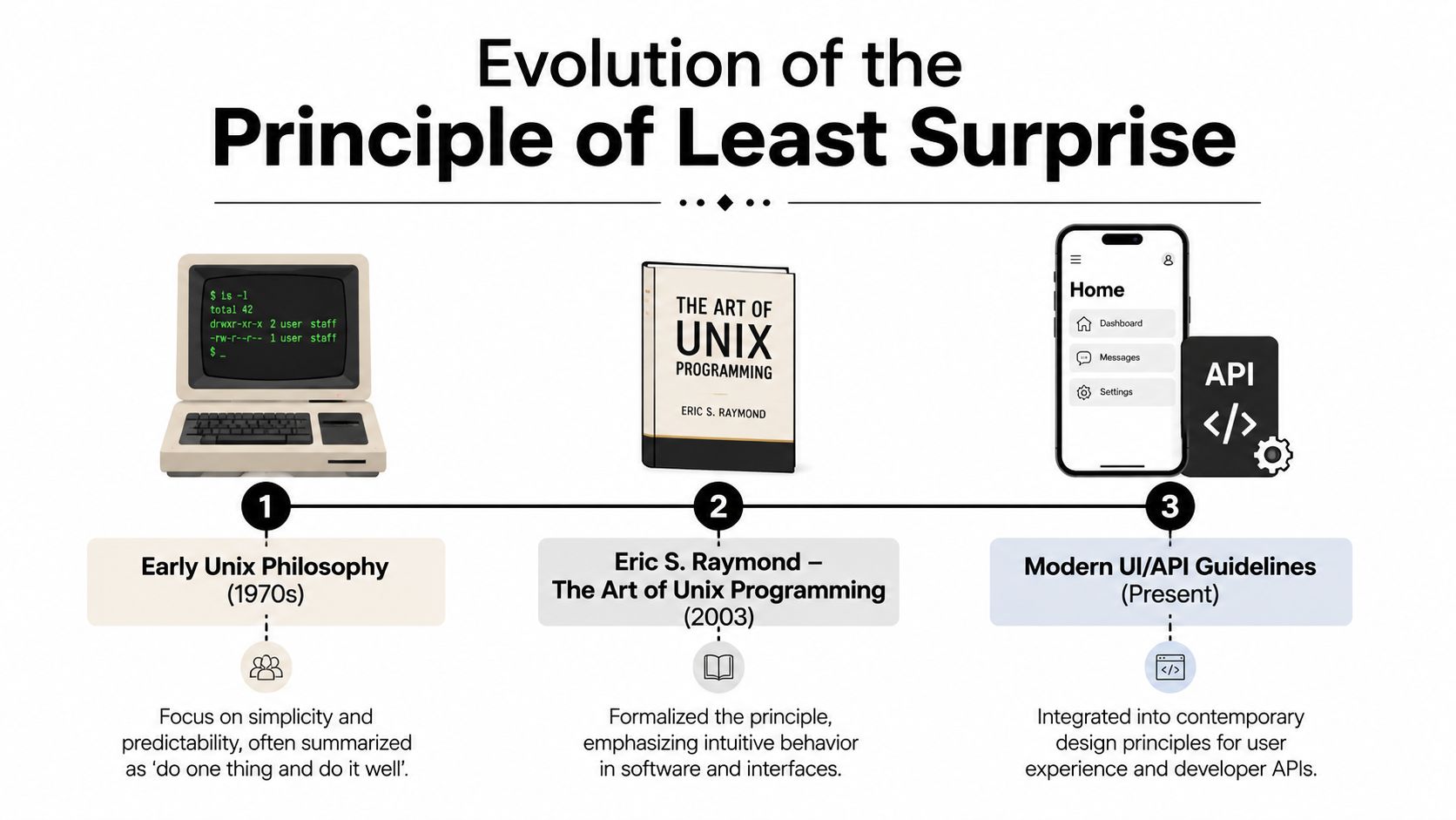
The principle of least surprise didn't appear out of nowhere as a UX slogan. It grew out of Unix culture, where composability and convention mattered because systems had to work together cleanly. That older engineering mindset shaped how developers thought about predictable behavior long before product teams started labeling it as a usability principle.
Eric S. Raymond's The Art of Unix Programming helped formalize that thinking for a broader audience. His discussion treated least surprise as a general interface rule and tied it to familiar conventions, reusable interaction models, and the user's mental model (Wikipedia on the principle of least astonishment). That framing mattered because it linked design quality to shared expectations, not just aesthetic neatness.
From Unix habit to mainstream product standard
Early Unix philosophy valued simplicity and tools that behaved consistently. That logic made its way into documentation style, command-line conventions, and later into API design, where developers needed functions and endpoints to behave in obvious ways. Once software spread across more industries, the same idea became useful for product teams that had to teach thousands of people, not just a tight technical audience.
The historical shift is important because it shows why POLS became more than a slogan. It became a norm that reduced training friction and made products easier to adopt across mixed skill levels. In modern software teams, that matters just as much in dashboards and mobile apps as it does in code.
Why the historical context still matters now
Today's AI products make this history feel even more relevant. Adaptive systems can be helpful, but they can also feel inconsistent if the product changes behavior without enough explanation. The oldest lesson in the principle still holds, if users can't predict the result, they have to spend time learning the interface instead of using it.
That's also why the principle keeps showing up in API and documentation practices. It gives teams a shared standard for judging whether an interaction feels coherent or needlessly inventive. For teams that want a visual timeline of this evolution, the historical graphic below maps the path from Unix to modern UI and API design.
Common Anti Patterns to Avoid
The fastest way to violate the principle of least surprise is to make something look harmless while hiding a different outcome underneath. A method named like a getter that changes data, a button that appears to delete but archives, or a checkbox that triggers side effects all create the same problem, the user's expectation and the system's behavior part ways.
That confusion isn't just annoying. In API design, behavior should be obvious, consistent, and predictable, and violations like methods that do nothing or hidden preconditions create “spooky action at a distance,” which confuses both users and developers (DZone on APIs and the principle of least surprise). The safer pattern is to make the action and the outcome line up as tightly as possible.
The most common surprises teams ship
Here are a few patterns worth hunting down in reviews:
- Hidden side effects: A function called
getUserthat updates records in the background makes debugging harder and trust lower. - Non-obvious state changes: A button that changes the page layout, then switches tabs without indication, leaves users guessing what happened.
- Mystery preconditions: A feature that only works after a hidden setup step forces people to discover rules by failure.
- Do-nothing actions: Controls that appear active but fail without a clear message waste user attention and make the product feel broken.
These anti-patterns often slip in when internal teams optimize for developer speed instead of user clarity. That trade-off can be tempting, but it usually costs more later in support, documentation, and retraining.
What to replace them with
The fix is usually simpler than the bug. Name actions by their real effect, add visible confirmations when something changes state, and make failure states explicit. If an action archives instead of deleting, say so in the label. If a method has prerequisites, document them where the action happens, not in a separate page that nobody reads.
A useful companion resource on turning flows into clearer journeys is optimizing ecommerce customer journeys, especially for teams that want to reduce friction without flattening their product logic. For broader structure across screens and flows, the internal guide on best practices for creating powerful user flows fits naturally here.
The best surprise is usually no surprise at all, just a system that behaves the way the label promised.
Practical Examples in Software and UX
Two short examples make the idea easier to apply. First, a backend team names an endpoint POST /orders and uses it to create an order, then reserves more unusual logic for separate actions with clear names. That feels boring in the best way, because the verb, the resource, and the result all match what developers expect from common HTTP patterns.
Now compare that with a mobile app that adds a custom gesture where a swipe left can mean delete in one screen and save in another. Users don't carry that distinction in their heads automatically, so they hesitate before acting. The gesture itself becomes the task, which is exactly the kind of cognitive load ESR warned about in his discussion of familiar conventions (ESR on interface design).
Clear interfaces reduce second-guessing
A good pattern in both software and UX is to make the next step visible before the user commits. Inline hints, standard button labels, and familiar icon placement help people move without testing every corner case. That isn't decoration, it's a way of keeping attention on the goal instead of the mechanics.
A product team reviewing a checkout flow can ask a simple question, “If a new user saw this for the first time, what would they assume?” If the answer is unclear, the interface needs a stronger cue, not a cleverer interaction.
When small changes matter most
In ecommerce, standard input fields for shipping and payment usually work better than experimental layouts because users already know where those details belong. In mobile apps, native gestures often outperform custom ones because people bring platform habits with them. In both cases, the design wins when it aligns with what people already know.
That same logic applies to documentation and API contracts. If a parameter name suggests one thing but the function behaves another way, developers will build mental workarounds and then blame the API when those workarounds break.
For teams that want a practical partner perspective on how AI-driven products can stay understandable while still feeling modern, the strongest takeaway is simple, use familiar structure first, then add novelty only where it earns its keep. Otherwise, you're asking users to learn your invention before they can finish their task.
Applying the Principle in AI and Personalization
AI complicates the principle of least surprise because adaptive behavior is useful, but adaptation can also feel inconsistent. A recommendation engine, assistant, or auto-filled workflow may delight one user and unsettle another if the system changes too much without explanation. Recent UX guidance recommends testing for surprise with heatmaps and session recordings so teams can balance relevance with user comfort (UX Designing on principle of least surprise).
The practical question is not whether AI should personalize. It should. The question is how far the product can bend expectations before it needs to explain itself.
Keep the core path predictable
Stable navigation, familiar button labels, and consistent defaults should stay intact even when the system gets smarter. AI can live inside those patterns by changing recommendations, ranking, or suggestions without changing the meaning of the controls. Users are usually fine with intelligence, they're less fine with mystery.
That's where contextual explanations help. If the model ranks a result highly because of recent activity, say so in a short hint. If the system is making a recommendation based on history, label it clearly and keep a user-controlled way to adjust the behavior.
Use governance to keep behavior understandable
For enterprise AI, predictability isn't just a design issue, it's a governance issue. Teams thinking about establishing AI governance in enterprises usually need the same thing designers do, visibility into what the system is doing, why it's doing it, and how to roll it back if it surprises people too often.
That's where logging, parameter controls, and versioned prompts matter. They give product, design, and engineering teams a way to trace behavior without guessing. If the AI changes tone, content, or thresholds, the team can inspect the setup instead of treating every surprise as a mystery.
Good AI rule: personalize the outcome, not the meaning of the interaction.
A product can even show confidence cues or fallback defaults when the model is uncertain. That way, users can decide whether to trust the suggestion or keep using the standard path. The goal is a product that feels helpful, not one that keeps rewriting its own rules.
Industry Specific Applications
Different industries use the principle of least surprise in different ways because different users arrive with different expectations. An ecommerce shopper wants checkout to feel familiar. A clinician wants a portal to follow the logic of a care workflow. A financial analyst expects standard terminology. A media viewer expects playback to work the way it does everywhere else.
Ecommerce and retail
Ecommerce teams should keep the purchase path tight, reuse standard card-entry patterns, and avoid changing button meanings halfway through checkout. A user who has already committed to buying should not have to decode a new layout at the payment step. Predictability here protects revenue because it lowers hesitation at the point of conversion.
Fintech and SaaS
Fintech users are especially sensitive to terminology. Labels should match established financial language, and actions that affect balances, transfers, or reporting should be explicit. SaaS products face a similar challenge in admin screens, where a small wording change can alter how power users interpret risk.
Healthcare and media
Healthcare portals need to mirror clinical workflows closely enough that patients, clinicians, and administrative staff all know where to go next. The same page should not mean the same thing for every role, so role-based defaults matter. Media products, by contrast, succeed when playback controls, queue behavior, and content switching remain familiar across devices and regions.
Role and market expectations are part of the design
The hardest part is that surprise isn't universal. A feature that feels obvious to one audience can feel foreign to another, especially across markets with different conventions or user roles. That's why teams should segment expectations instead of assuming one interface rule fits everyone.
If you're designing for a broad audience, test the flow against the users who rely on it, not just the people who built it. That usually surfaces the mismatch before it turns into support noise or drop-off.
Checklist and Conflict Mitigation
A strong checklist keeps the principle of least surprise from turning into a vague slogan. Start by aligning labels with user language, because the screen should sound like the people using it. Then test with real target users, track surprise signals, and write down the conventions so the whole team stays consistent.
A practical checklist for teams
- Align labels with user language: Use the words customers already use, not internal jargon.
- Test with five target users: Lightweight usability sessions can uncover about 85% of usability issues (Dovetail on the principle of least surprise).
- Track surprise signals: Watch heatmaps, drop-off points, click paths, and session recordings for places where users hesitate.
- Document conventions: Keep style rules, interaction patterns, and API behavior in one place, then update them when the product changes.
- Review AI behavior centrally: Keep prompts, parameters, logs, and cost visibility under one management layer so adaptive features stay traceable.
For teams formalizing that documentation layer, the internal guide on technical documentation best practices is a useful complement.
When predictability conflicts with innovation
Sometimes a team wants to surprise users on purpose, usually to add speed, personalization, or automation. That's fine, but the change needs a boundary. Roll out the new behavior to a segment first, use feature flags, and give people an explanation where the action happens.
You can also separate core behavior from experimental behavior. Keep the main path stable, then add novelty in a clearly labeled layer. That way, users can choose the new experience without losing confidence in the old one.
If the team can't explain a surprising behavior in one sentence, the product probably isn't ready to ship it.
For AI-powered applications, the Wonderment Apps prompt management system becomes especially relevant as an operational model, because a prompt vault with versioning, a parameter manager for internal database access, logging across integrated AIs, and cost visibility all help teams keep behavior consistent while they experiment. That's the kind of control layer that lets a product modernize without drifting away from what users expect.
If your team is balancing AI modernization, UX consistency, and API clarity at the same time, talk with Wonderment Apps about a build approach that keeps users oriented while your product gets smarter.