


You launch a new onboarding flow, watch the dashboard, and everything looks fine at first glance. Then week two arrives, and users start disappearing in a way that your single retention number never warned you about. That's the moment cohort analysis earns its keep, because it shows you which users changed, when they changed, and which part of the journey deserves a closer look.
For software and product teams, that matters because an average hides the story. A healthy-looking overall metric can sit on top of a weak channel, a broken step in onboarding, or a cohort that drops off after first use. If your stack is getting more AI-driven, a prompt management system can also help standardize cohort workflows by keeping prompts, parameters, logs, and cost tracking organized, so reporting stays consistent across teams and releases.
Introduction to Cohort Analysis for Modern Apps
A product manager usually feels the pain before the chart explains it. A release goes live, signups look steady, and then support tickets start to mention confusion, slow activation, or a strange drop in repeat use after the first few sessions. Cohort analysis gives that manager a cleaner answer than a broad retention rate ever could, because it groups users by a shared start point and follows them over time.
That time ordering is the key. The underlying statistical idea comes from cohort study design, where researchers follow groups that share a common starting point to observe outcomes over time, and modern product analytics uses the same logic for user behavior (cohort study statistics overview). In a digital product, that means you can compare users by signup date, first purchase, or first meaningful action instead of blending everyone into one noisy average.
This is also where modern AI-powered analytics workflows start to matter. If teams are generating cohort summaries, prompt-driven reports, or assisted explanations, a central prompt management layer helps keep the process reproducible, especially when different teammates are asking the same question in different ways.
Practical rule: if a metric looks stable but your newer users feel different, stop looking at the average and inspect cohorts.
A good reference point for retention language is RecurX on retention insights, which frames retention as a pattern you learn from over time rather than a single snapshot. That mindset is the right one for software teams, because retention problems usually hide in timing, not just totals.
Understanding the Key Concepts of Cohort Analysis
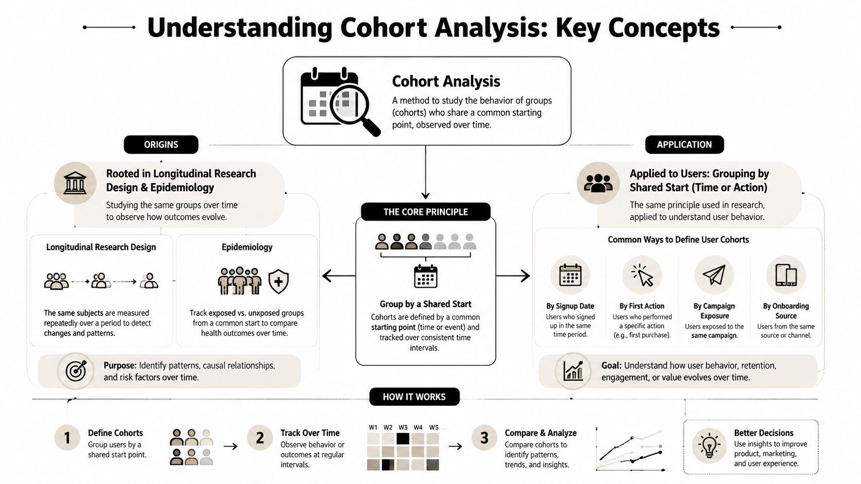
A product manager sees a retention chart that looks flat, but support tickets are rising among recent users. That mismatch is a clue to stop reading the average and start grouping users by the right shared event. Cohorts let you do that by collecting users with a common starting point, then following what happens to each group over time.
The statistical root of the method comes from longitudinal research. In epidemiology, researchers compare groups that share an exposure or other starting condition and track outcomes forward in time, often using measures such as risk ratios (cohort study statistics overview). Product analytics uses the same logic for behavior, but the shared condition can be signup, first purchase, first meaningful action, or another event that better matches the question being asked.
Why time order matters
A snapshot can hide the story. If a user group weakens in week four, analysts still need to know whether the issue began during acquisition, during activation, or after a product change altered behavior. Cohort analysis keeps that sequence intact, which makes it better for spotting retention decay, churn points, and differences between user journeys.
It also helps separate time-indexed segmentation from misleading averages. The UCLA cohort analysis note explains that cohorts can be used to distinguish age effects from period effects, so analysts can tell whether a drop comes from the group's stage in its lifecycle, a calendar-time event, or both (UCLA cohort analysis note).
A cohort chart asks a sharper question than a total-user report. It asks what happens to the people who started under the same condition.
For teams building reports, prompts, or AI-assisted summaries, behavioral analytics workflows for product teams are easier to manage when the prompt setup stays consistent. Wonderment Apps' prompt management toolkit helps teams keep cohort definitions, reporting language, and interpretation steps aligned, which matters when different teammates need the same analysis framed in slightly different ways.
A good retention takeaway is already captured in RecurX on retention insights, where retention is treated as a pattern that becomes visible over time instead of a single snapshot. That framing fits software teams well, because retention problems usually live in timing, not in the total count alone.
Choosing Cohorts and Metrics for Your Analysis
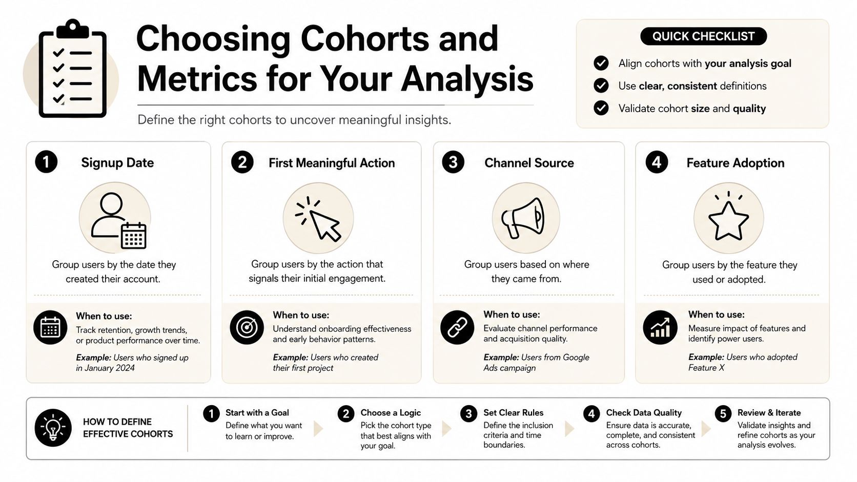
The wrong cohort definition can make a good product look weak. A signup-date cohort is often the default, but that doesn't mean it's the best choice, because the business question might be about activation, channel quality, or feature adoption. Mixpanel's guidance notes that cohorts can be defined by timing, behavior, or characteristics, and that first meaningful action, channel source, and feature adoption can answer more precise questions than signup alone (Mixpanel cohort analysis guide).
Match the cohort to the decision
If you're trying to improve onboarding, a signup cohort may be fine as a starting point, but it can hide delays in getting to value. If you're running ecommerce, a first-purchase cohort is often more useful because it anchors the user to actual buying behavior instead of registration noise. A feature-adoption cohort is better when the product team wants to know whether a specific capability changes long-term behavior.
A simple way to pressure-test the definition is to ask what you would do differently after the report. If the answer is “nothing,” the cohort probably isn't specific enough. For a practical segmentation lens that pairs well with this thinking, the guide to AI-driven segmentation is worth a look, especially if your data team is blending behavioral segments with automated reporting.
Pick a return event that actually means something
The return event should reflect real product value. For a consumer app, that might be a repeat session, while a SaaS team may care more about weekly active use, a second login, or a completed workflow. The key is consistency, because your cohort chart only works if the return event is meaningful across all cohorts.
Practical rule: choose the cohort anchor and the return event together, not separately.
Interval choice matters just as much. The right cadence depends on how people naturally use the product, because a weekly view can hide churn in a high-frequency app, while a daily view can create noise in a slower B2B workflow. If the cohort definition doesn't fit the cadence, the curve will look more confusing than useful.
How to Perform Cohort Analysis with SQL and Analytics Tools
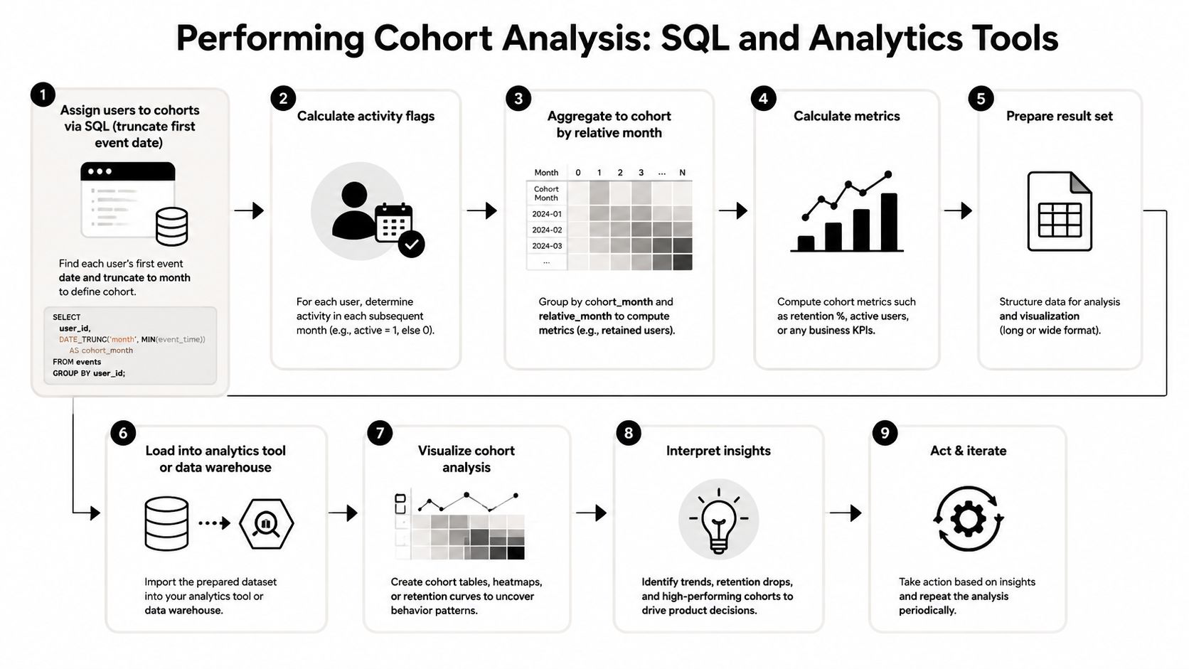
The mechanics are straightforward once you break them into stages. In SQL-based implementations, the usual pattern is to assign each user to a cohort using their first event date, often truncated to a week or month, then calculate activity in later periods and aggregate by cohort and period (TDWI cohort analysis overview). That structure gives you a cohort grid you can read row by row and period by period.
Start with the question and the identity model
Before touching SQL, define the business question and the user identity you trust. Cohort analysis depends on a stable user ID, because you can't follow a group over time if the same person appears as several different records. If the question is about activation, then the first meaningful event may matter more than raw signup.
A typical SQL pattern looks like this in concept, even if your warehouse syntax differs:
- Identify each user's first qualifying event.
- Truncate that date to the cohort grain you chose, such as week or month.
- Join later activity back to the cohort table.
- Flag whether the user returned in each later period.
- Aggregate by cohort and period.
A more precise workflow also follows four stages, choose the question, define the metrics, define the cohorts, then analyze and test whether the result makes sense (cohort analysis workflow). That order helps teams avoid building a beautiful chart around the wrong question.
Let the tool handle the repetitive parts
Most analytics tools can automate the grid once the event model is clean. Amplitude, Mixpanel, and Segment can all help surface cohort views, especially when events are already tagged consistently and the return event is defined in advance. The value of the UI is speed, while the value of SQL is control, auditability, and the ability to reproduce the logic later.
For mobile teams, a focused analytics workflow can matter even more because app usage patterns often need tighter identity and event discipline. A useful companion read is mobile application analytics, since mobile retention often depends on event timing and device-level consistency.
Practical rule: use SQL for the logic, then let the analytics tool make the result easy to inspect and share.
That's also where a prompt management layer can simplify modern AI-assisted reporting, especially when your team wants consistent prompt templates, parameter handling, logging, and cost visibility across repeated cohort questions. The goal isn't more automation for its own sake, it's repeatability that survives team turnover and product changes.
Interpreting Cohort Analysis Results
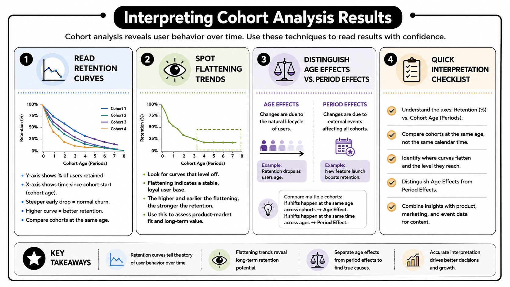
A cohort table is only useful if your team can read it without mistaking normal variation for a product win or a temporary dip. A launch, billing change, holiday spike, or channel mix shift can move the numbers in ways that have nothing to do with the cohort itself. The point is to separate user age, calendar timing, and acquisition context before drawing a conclusion.
Start with the shape of the retention curve. A sharp early drop usually means users hit friction soon after the first use, while a flatter curve suggests the cohort found a repeatable habit. Side-by-side row comparison helps too, because newer cohorts can show whether the product is improving even if the top-line result still looks unchanged.
Read the curve, not just the cells
A single cell only gives you one point in time. The curve shows the story across the full lifecycle, and that story is usually more useful than any isolated percentage.
If the first few rows fall quickly, onboarding may be too confusing, too slow, or too disconnected from the value users expected. If later rows hold steady, the product may be doing a good job turning early interest into regular use. Analysts at product teams often find that this is also where the cohort definition matters most, because a signup-based cohort can hide the difference between casual signups and users who reached value through a specific action.
Watch for calendar-time contamination
A release, campaign, outage, or pricing change can affect several cohorts at once. That is a period effect, and it can make one cohort look unusually strong or weak for reasons that have little to do with user quality. If multiple cohorts move in the same direction during the same calendar window, inspect what changed in the product, the market, or the acquisition mix.
This is also where choosing the right cohort definition becomes more important than defaulting to signup date. A team that only groups by registration may miss key patterns, while a cohort built around activation, first purchase, or first successful AI workflow can tell a much clearer story. Wonderment Apps' prompt management toolkit can help teams standardize those AI-driven workflows, keep prompt templates consistent, and make repeated cohort questions easier to run and review. For churn-focused reads, teams can also pair this analysis with how to reduce customer churn.
A cohort chart should raise a question, not end one.
That mindset matters in product reviews and leadership meetings. The best readout explains whether the movement came from user age, a calendar-time event, or a shift in who entered the cohort. If those signals are still mixed together, segment one level deeper before making a call.
Use Cases and Best Practices for Different Industries
Different industries use cohort analysis for different decisions, even when the chart looks similar. In ecommerce, teams often care about which acquisition sources bring buyers who keep coming back. In SaaS, the focus usually shifts to activation, trial-to-paid conversion, or whether a cohort that adopted a feature early stays engaged longer.
Ecommerce and retail
Ecommerce teams often compare cohorts by acquisition campaign, first order date, or product category. That helps them see whether a promotion brought one-time deal seekers or long-term buyers. If a cohort bought during a seasonal campaign but faded quickly afterward, the issue may be traffic quality rather than merchandising.
SaaS and software products
SaaS teams usually need tighter timing around onboarding and habit formation. A weekly cadence often makes sense because many B2B products don't get used every day, and the goal is usually to understand whether users reach value fast enough to keep paying. The most useful question is often not “Did they sign up?” but “Did they complete the behavior that predicts continued use?”
Healthcare and wellness apps
Healthcare and wellness products often use cohorts to track engagement with monitoring, reminders, or plan adherence over time. Here, consistency matters more than volume, because the product may be used on a scheduled basis instead of continuously. A cohort view helps separate users who never formed the habit from users who only dropped because the timing was too aggressive.
Modern product analytics vendors often measure cohorts by life-month rather than calendar month, which aligns each cohort to its own age in the product and makes drop-off easier to spot (Statsig cohort analysis guide). That approach is especially useful when you need to compare acquisition channel quality or onboarding changes without letting calendar timing blur the picture.
For churn-oriented teams, how to reduce customer churn pairs naturally with cohort work, because it keeps the conversation focused on the behaviors that lead users away from the product. The best practice across industries is the same, keep the cohort definition tied to the decision, and make the return event meaningful enough to act on.
Avoiding Common Mistakes and Next Steps
Cohort analysis breaks down fast when the setup is sloppy. The most common failure is inconsistent user identity, because fragmented IDs make it impossible to trust the timeline. Another is using the wrong interval, since a product that behaves weekly can look broken if you only inspect daily return windows.
A third mistake is treating a cohort dip like proof of causation. A drop that lines up with a campaign, release, or season can be real, but the chart alone doesn't prove why it happened. That's why cohort analysis works best as an investigative layer, not as the final answer.
Keep the analysis reproducible
If your team runs cohorts in notebooks, spreadsheets, and ad hoc SQL queries, the definition drift will eventually catch up with you. A versioned workflow is safer, especially when prompts, parameters, and reporting logic change across teams or releases. That discipline matters even more if your analytics process uses AI-generated summaries, because the output needs to be traceable.
A sound next step is to pair cohort findings with experiments or causal validation. If one cohort underperforms, test a change in onboarding, messaging, or feature flow before rewriting the whole experience. Then re-run the same cohort logic against the next group so you're comparing like with like.
Practical rule: cohort analysis should inform the test plan, not replace it.
For teams modernizing their software stack, Wonderment Apps offers a prompt management toolkit that includes a prompt vault with versioning, a parameter manager for internal database access, logging across integrated AI systems, and cost tracking for cumulative spend. If you want to see how that can support cleaner cohort workflows and more repeatable analytics operations, visit Wonderment Apps and request a demo.