
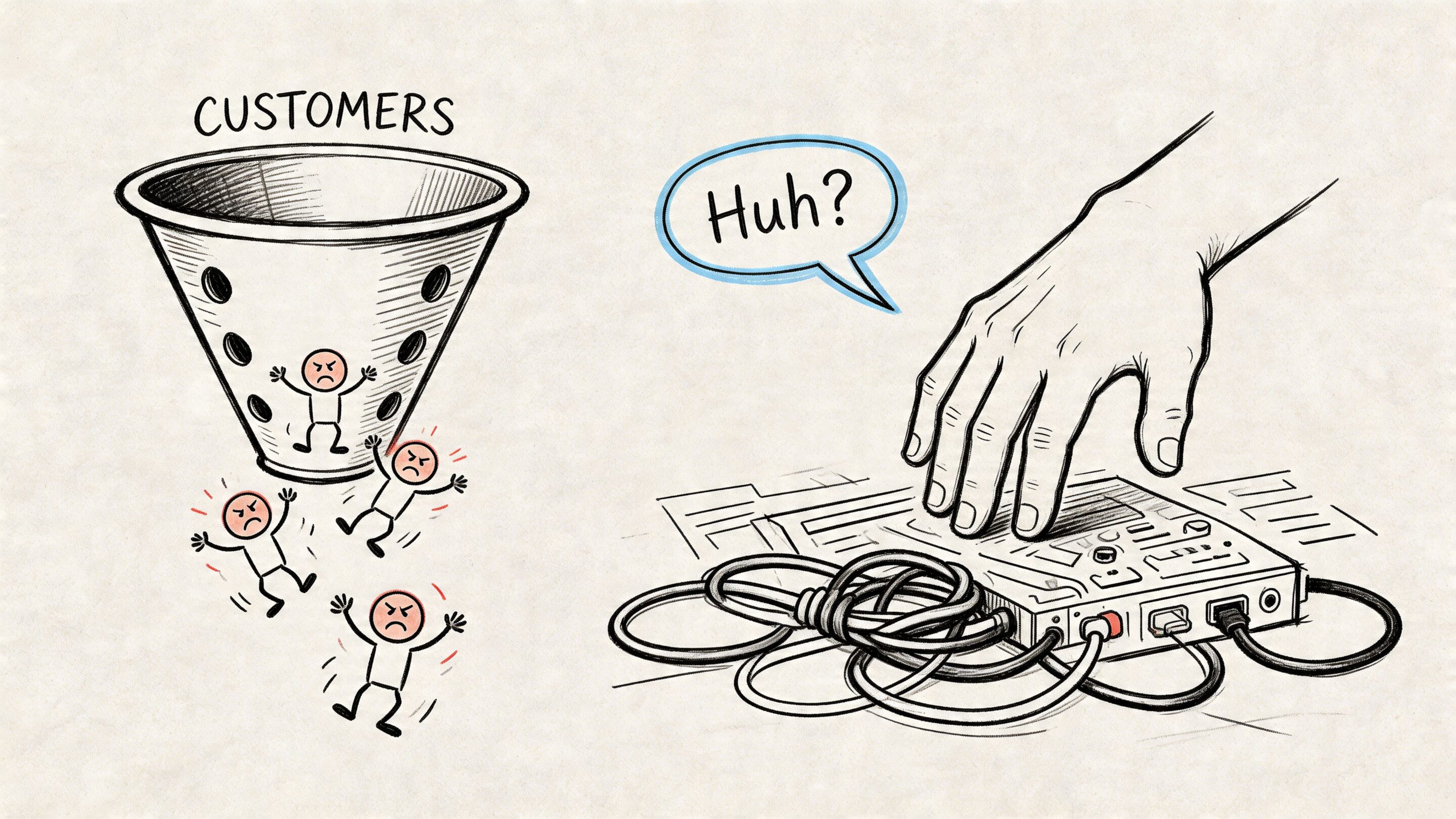
You launch the product. Signups look healthy. The dashboard in your analytics tool says people are getting in. Then the ugly part shows up. Users log in once, click around, stall during setup, and disappear before your team ever gets a fair shot at proving value.
That pattern usually isn't a feature problem. It's a ux design for saas problem.
SaaS products live or die on repeat usage. A customer doesn't buy a box, install software once, and call it done. They commit part of their daily work, team habits, data structure, and budget to your product. If the experience feels confusing, slow, or unpredictable, they don't just get annoyed. They stop building their workflow around you.
The good news is that SaaS UX is fixable when product, design, and engineering treat it as a system instead of a layer of polish. That includes modern AI behavior too. If your app now includes search copilots, summarization, recommendations, or workflow automation, those aren't side features anymore. They're part of the core experience, and users judge them by the same standard they judge the rest of your product: does this help me do my job with less friction?
Why Your SaaS Is Leaking Customers and How UX Can Help
The most common churn story is painfully familiar. A team buys into your promise, invites a few coworkers, imports some data, then hits a wall. Navigation feels off. Setup asks for too much too early. The product explains features instead of helping users finish real work.
That leak shows up in revenue faster than many founders expect. Every 1% improvement in user experience can translate to a 1-2% reduction in churn in SaaS products, and companies that prioritize design outperform peers by 2:1 in revenue growth, according to Ztabs' summary of SaaS UX benchmarks and McKinsey's design finding.
What the leak usually looks like
A weak SaaS experience tends to fail in a few predictable places:
- Onboarding asks before it proves: The product collects settings, team structure, integrations, and preferences before helping the user reach a first win.
- Navigation mirrors the org chart: Menus reflect internal teams or technical architecture instead of the user's mental model.
- AI feels bolted on: A chatbot appears in the corner, but it can't act inside the workflow, explain itself clearly, or respect user control.
- Support becomes the product: If users need docs, tickets, or onboarding calls for basic tasks, the interface isn't carrying its weight.
Practical rule: If a user can't tell what to do next within a few seconds of landing in your app, your UX is already taxing retention.
Strong UX doesn't mean making everything minimal. It means reducing hesitation at the exact moments where people decide whether your product is worth learning. Teams that want a more detailed look at retention mechanics can review these practical ways to reduce customer churn.
Where AI modernization changes the bar
Modern SaaS users increasingly expect the product to be responsive, contextual, and smart. They want help writing, summarizing, filtering, recommending, and automating. But they also want to stay in control.
That's why AI modernization belongs inside UX strategy, not in a separate innovation bucket. A product that uses AI well feels faster and clearer. A product that uses AI poorly adds one more layer of uncertainty.
Understanding the Unique DNA of SaaS UX Design
Designing a streaming app and designing a billing platform aren't remotely the same job. One aims for immediate appeal and low-friction engagement. The other has to support repeated work, complicated permissions, changing states, and dense information over a long relationship.
A useful analogy is this. B2C design is often like renting a nice home for a weekend. SaaS design is more like building a workshop where people do their job every day. The workshop doesn't need to charm users with novelty. It needs to help them find tools, trust the layout, and move efficiently without getting hurt.
SaaS is about workflow, not just interface
In consumer apps, delight can carry a lot of weight. In SaaS, workflow fit carries more. Users stay when the product becomes the obvious place to complete a recurring task, coordinate with teammates, or make a decision.
That means good ux design for saas has to answer different questions:
- What job is the user trying to finish repeatedly
- What information do they need at each step
- What should be visible now versus later
- Where can the system reduce effort without reducing clarity
If you're refreshing the basics, AppLighter's overview of fundamental app user experience principles is a useful companion because many of the same foundations still apply. SaaS just stretches those principles across more states, more users, and higher stakes.
Multiple stakeholders create real design tension
SaaS products rarely have one user. They usually have a cluster of users with overlapping but different priorities. End users, administrators, and billing teams often need different views, controls, and information, which makes permission hierarchies, audit trails, and role-based dashboards a central design challenge as discussed in Greensighter's analysis of SaaS UX complexity.
That complexity changes how teams should design:
| User type | What they usually care about | Common UX risk |
|---|---|---|
| End user | Speed, clarity, task completion | Too much admin noise |
| Admin | Permissions, settings, oversight | Buried controls |
| Billing or ops | Accuracy, account status, records | Poor visibility into account state |
A weak team solves this by piling settings into one giant admin area and hoping users sort it out. A stronger team creates role-aware paths. The product doesn't become fragmented, but it does become selective about what each person sees and when.
Products break trust when they expose every capability to every person in the same way.
Data density changes everything
Most SaaS products aren't empty canvases. They hold records, filters, reports, statuses, permissions, logs, and actions that interact with each other. That means layout isn't only visual. It's operational.
A clean marketing-site mindset can backfire here. Hiding too much creates scavenger hunts. Showing too much creates paralysis. Strong SaaS UX finds the middle path. It makes complexity navigable instead of pretending complexity doesn't exist.
The Seven Pillars of High-Retention SaaS UX
The easiest way to audit a SaaS product is to stop debating screens in isolation and look at the system that keeps people using it. High-retention products usually get seven things right, even when their categories, audiences, and visual styles differ.
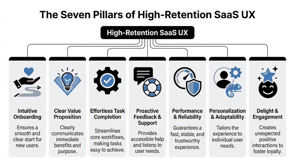
Intuitive onboarding
Onboarding should move the user to a meaningful outcome, not walk them through every feature you built.
A bad onboarding flow behaves like a museum tour. It points at parts of the product and says, "Here is the reporting tab." "Here is the settings menu." "Here is the collaboration panel." Users nod politely and remember almost none of it.
A strong onboarding flow gets the user to one clear first success. It teaches through action.
- Do this: Ask for only the setup information required to deliver the first result.
- Not that: Front-load every preference, integration, and role mapping on day one.
Insightful dashboards
A dashboard is not a collage of metrics. It's a decision surface.
Users open a dashboard to answer a question. What's changed? What needs attention? What should I do next? If the screen doesn't support those decisions, the dashboard is decoration.
A better dashboard structure usually includes a small set of high-priority signals, clear hierarchy, and obvious paths into action. The best ones adapt based on role and usage maturity.
A dashboard earns its place when it turns data into the next move, not when it proves your product stores lots of data.
Clear pricing UX
Pricing UX starts long before the checkout page. Users are evaluating trust every time they hit a limit, compare tiers, or try to understand what they'll pay for.
Confusion here creates a nasty kind of product friction because it infects the whole experience. Even users who like the workflow begin to wonder what else is hidden.
Good pricing UX does a few simple things well:
- Explains what changes across tiers in plain language
- Shows limits and usage clearly inside the product
- Previews consequences before an upgrade, downgrade, or overage event
What doesn't work is cleverness. If users need sales help to decode your plan logic, your pricing UX is doing damage.
Intelligent feature discoverability
Users can't adopt what they can't find, but that doesn't mean every feature belongs in the primary navigation.
Product teams often get trapped between two bad options. They either bury capabilities under generic labels, or they expose everything at once and flood the interface. The better path is contextual discovery. Show relevant features near the moment of need.
For complex SaaS, Object-Oriented UX, or OOUX, helps structure navigation around core objects such as Projects or Deals. Proper implementation can reduce onboarding knowledge gaps by 40-60% and improve task completion rates by 25%, according to F1Studioz's SaaS UI and UX guide. That matters because users usually think in terms of entities and relationships, not menu taxonomies.
A CRM user thinks, "I need this contact's activity and related company." A project manager thinks, "I need the tasks tied to this project and assigned users." OOUX mirrors that logic.
Blazing-fast performance
People don't separate performance from UX. They experience both as one thing.
If a table takes too long to load, a search hangs, or a save action feels uncertain, the product feels unreliable even if the design team produced a beautiful interface. Slowness breaks flow and lowers confidence.
The practical takeaway is simple:
- Do this: Prioritize the speed of the most repeated workflows, especially search, filtering, save states, and switching contexts.
- Not that: Spend cycles polishing low-traffic surfaces while core work feels sluggish.
Inclusive accessibility
Accessibility in SaaS is often treated like a compliance task. That's too narrow. It is a usability discipline.
A product that supports keyboard navigation, clear labels, readable contrast, understandable errors, and predictable interaction patterns helps more than users with permanent disabilities. It helps tired users, distracted users, new users, and users working under time pressure.
Accessibility work also improves design quality because it forces teams to remove ambiguity. If a control only makes sense visually, it probably isn't clear enough. If an error appears without guidance, it probably isn't helpful enough.
Meaningful personalization
Personalization is useful when it reduces effort. It becomes annoying when it guesses too aggressively or changes too much without explanation.
The strongest SaaS products personalize in grounded ways:
| Personalization type | Helpful version | Unhelpful version |
|---|---|---|
| Role-based layout | Shows admin tools to admins | Hides critical actions unpredictably |
| Saved preferences | Remembers views and filters | Changes defaults without telling the user |
| AI recommendations | Suggests next-best actions with context | Auto-executes decisions the user doesn't trust |
AI integrates into core UX, with recommendation panels, generated summaries, smart defaults, semantic search, and assisted workflows making the product feel dramatically more capable. But if those systems are opaque, users hesitate. Trust beats novelty.
From Confusing to Clear A SaaS Onboarding Example
A common onboarding mistake is easy to spot. The product signs a user in, dims the screen, and launches a parade of tooltips. Click next. Click next. Click next. The user hasn't done anything meaningful yet, but the app is already explaining advanced features they'll forget within minutes.
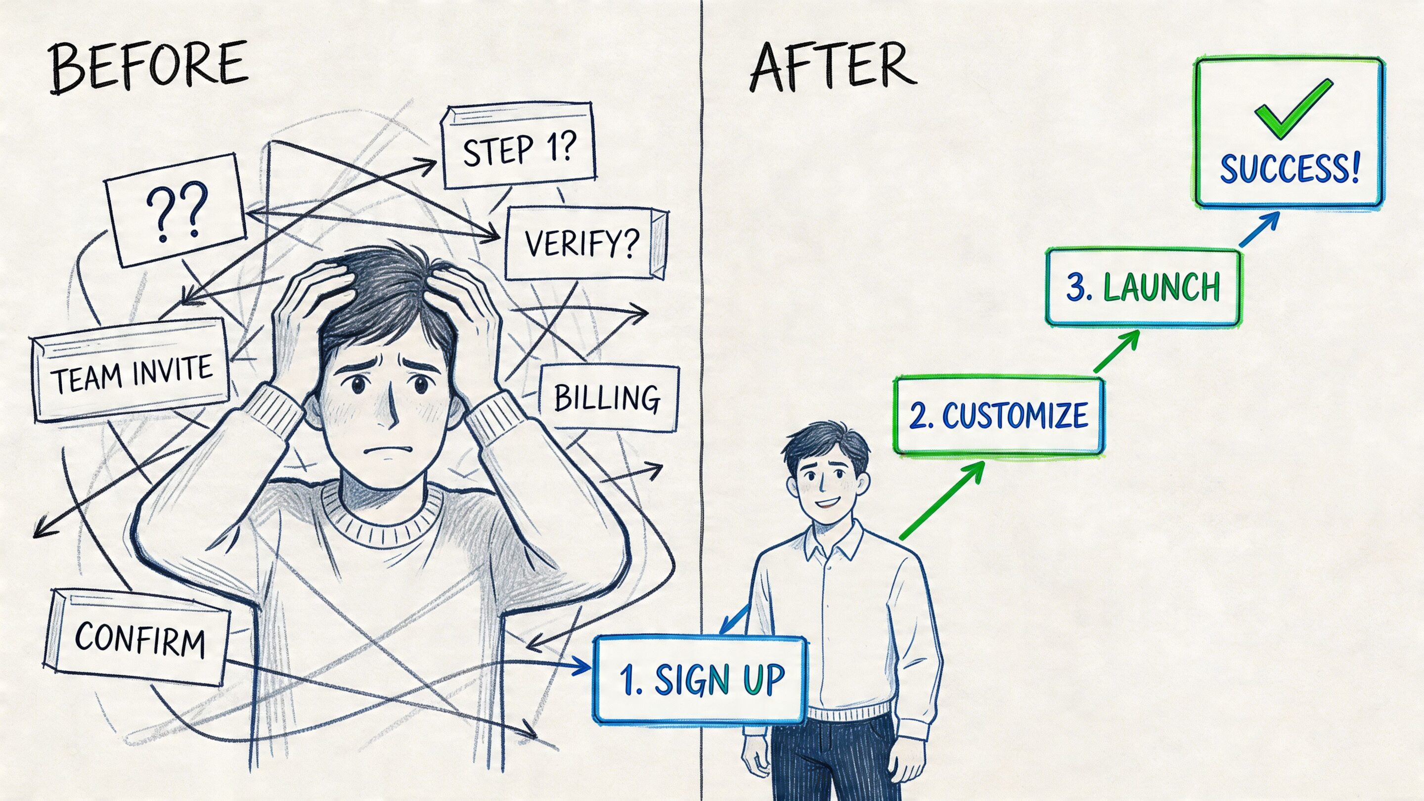
Let's use a fictional workflow product called Flowlane.
Before the redesign
Flowlane's first-run experience asks the user to do all of this before they get value:
- Create a workspace
- Invite the full team
- Choose a template
- Connect calendar and storage tools
- Watch a product tour
- Configure notifications
- Build a first workflow manually
Nothing in that sequence is individually unreasonable. The problem is the order. Flowlane is demanding commitment before earning confidence.
The user reaches step four and starts thinking, "I don't yet know if this is worth the setup." That's the moment retention gets injured.
After the redesign
The improved experience starts with a sharper question: what is the fastest path to the first useful outcome?
Flowlane changes the sequence:
- Step one: Ask what kind of work the user wants to manage
- Step two: Generate a starter workflow with sample structure
- Step three: Prompt the user to complete one real task inside it
- Step four: Offer optional team invites after that success
- Step five: Introduce integrations only when they provide the next obvious benefit
Now the product teaches through momentum. The user sees a useful board, completes a task, and understands the point of the tool before being asked to configure the world.
Good onboarding replaces explanation with progress.
This is also where progressive disclosure matters. Instead of showing every setting at once, the interface reveals complexity when the user reaches a moment that justifies it. Secondary actions stay available, but they don't dominate the screen.
If you're looking for examples of how onboarding can flex across different product shapes, Robotomail's roundup of various SaaS onboarding use cases is helpful because it shows how onboarding should adapt to the product's real job rather than follow one template.
Why this version works better
The redesigned flow does three practical things right:
- It shortens the distance to the first win: Users learn what the product does by using it.
- It delays expensive asks: Team invites and integrations come after value is clearer.
- It introduces complexity in layers: Users aren't forced to understand the full system on minute one.
Teams building this kind of flow usually benefit from mapping every decision point and dead end before they polish UI. A useful framework for that work is this guide to creating powerful user flows.
How to Measure the ROI of Your UX Improvements
If UX work can't be tied to business outcomes, it gets treated like taste. That's a mistake. In SaaS, UX should be measured the same way any core product investment is measured. With behavior change, retention movement, and revenue impact.
A prettier interface isn't the goal. Better usage is the goal. Better renewal is the goal. Better expansion is the goal.
Start with the metrics that matter
The cleanest measurement stack usually includes a mix of journey metrics and business metrics:
- Activation rate: Are new users reaching the first meaningful milestone
- Time-to-value: How long until they get the first useful result
- Feature adoption: Are users discovering and using the capabilities tied to stickiness
- Task success: Can users complete core workflows reliably
- Retention and churn: Are users staying
- Expansion behavior: Are accounts growing into more usage, seats, or features
There is direct business evidence behind this work. SaaS products with strong UX show a +21% improvement in activation from optimized onboarding, +34% higher retention at Day 90 from personalized journeys, and a +28% increase in expansion revenue from better feature discovery, according to Millipixels' analysis of SaaS UX design outcomes.
Mapping UX initiatives to business KPIs
| UX Initiative | Primary Metric to Track | Expected Business Outcome |
|---|---|---|
| Redesign onboarding around first value | Activation rate | More users reach the product's useful core behavior |
| Simplify setup and remove early friction | Time-to-value | Faster confidence and lower early drop-off |
| Improve feature discovery inside workflows | Feature adoption | Better expansion potential |
| Personalize journeys by role or intent | Day 90 retention | Stronger ongoing engagement |
| Clean up core task flows | Task success and support themes | Fewer blocked users and less avoidable support load |
This table matters because it forces teams to stop saying "we improved UX" in the abstract. Instead, they can say, "We changed the onboarding sequence, activation moved, and retention for that cohort improved."
Avoid the vanity metric trap
Page views, raw session counts, and click totals can be useful diagnostics, but they rarely prove UX value on their own.
A healthier measurement discipline looks like this:
- Pick one behavior that matters. Example: creating the first project, sending the first invoice, or completing the first report.
- Define the product change clearly. Example: removed a setup step, changed navigation labels, or added contextual guidance.
- Track the before-and-after cohort. Don't blend everyone together.
- Tie the result to retention or expansion. If the behavior doesn't support business health, it isn't enough.
If a UX improvement doesn't change user behavior, it was decoration.
The strongest product teams also review qualitative evidence alongside the KPI dashboard. Watch session recordings. Read support tickets. Interview churned users. Analytics tell you where to look. User evidence tells you why.
Implementing Great SaaS UX A Cross-Functional Checklist
Great SaaS UX doesn't come from handing wireframes to engineering at the end of planning. It comes from product, design, and engineering making the same core decisions together. That is even more true when AI enters the workflow.
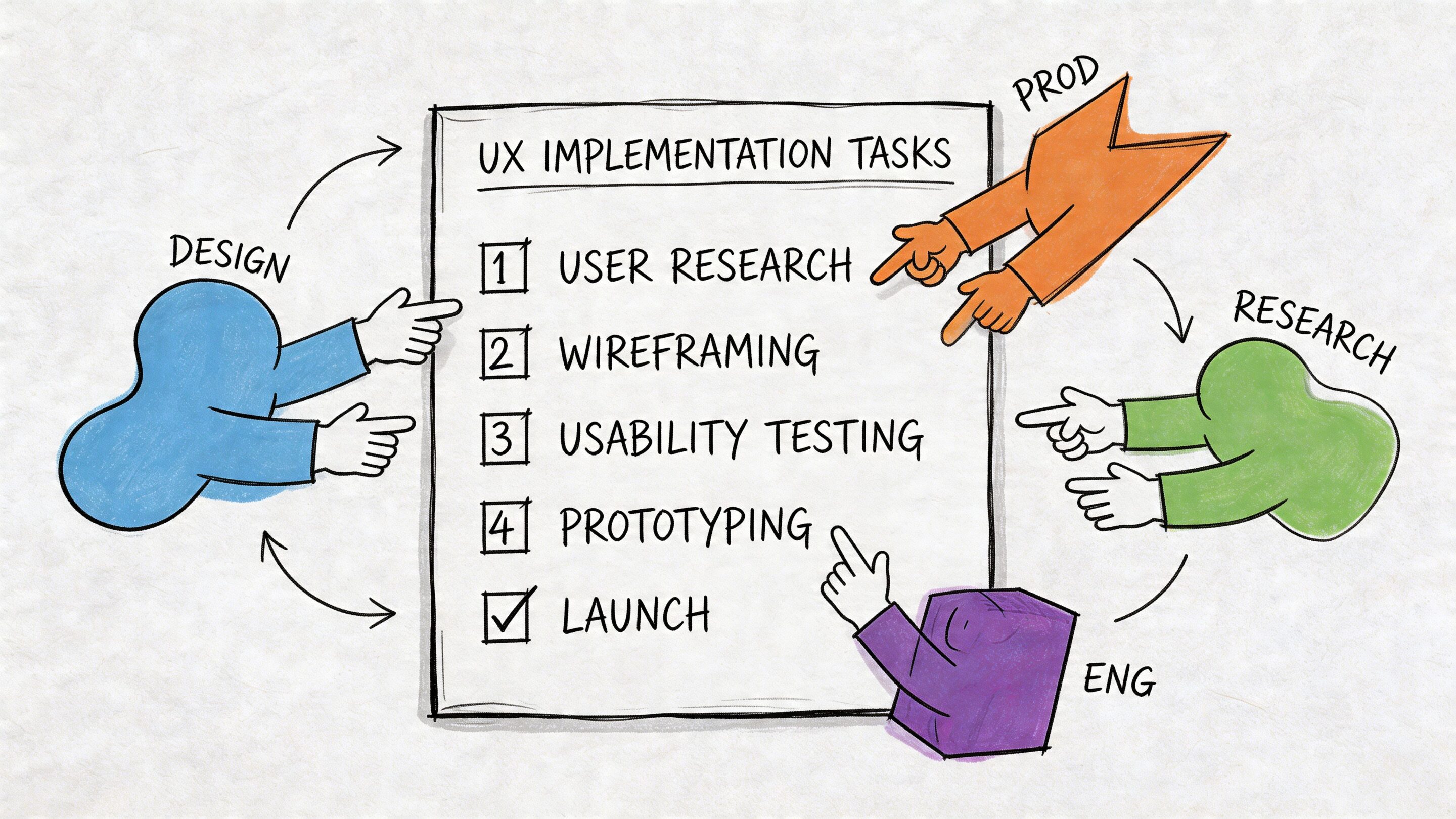
What product should own
Product leaders need to define the experience in operational terms, not only roadmap terms.
Use this checklist:
- Clarify the first value event: Decide what the user must accomplish early to understand the product's payoff.
- Prioritize workflows over features: A backlog full of capabilities can still produce a poor experience if the main path is clumsy.
- Identify role differences early: End user, admin, and account owner flows should not be discovered halfway through build.
- Set success metrics before design starts: Teams make better trade-offs when activation, retention, and task completion are already on the table.
A lot of this work gets sharper when teams run planning in close product-design cycles instead of sequential handoffs. This overview of product management sprints and UX sprints is a useful model for keeping discovery and delivery aligned.
What design should own
Design's job in SaaS is to reduce ambiguity, not just produce polished screens.
A practical design checklist looks like this:
- Model the core objects and relationships: If the information architecture is wrong, screen polish won't save it.
- Design states, not only happy paths: Empty, loading, error, limited-permission, and success states all shape trust.
- Use progressive disclosure deliberately: Keep advanced options accessible, but don't make beginners absorb expert complexity.
- Prototype realistic data conditions: Dense tables, long labels, edge-case filters, and permissions should appear before engineering starts.
The fastest way to create a messy enterprise interface is to design with fake simplicity and build with real complexity.
What engineering should own
Engineering teams influence UX far more than many organizations admit. Performance, state management, reliability, and AI behavior all show up directly in the user experience.
Engineering should pressure-test:
| Engineering concern | UX consequence if ignored |
|---|---|
| Slow data fetches | Product feels unreliable |
| Weak permission handling | Users see the wrong things or miss critical controls |
| Inconsistent state management | Buttons, saves, and records behave unpredictably |
| Poor observability | Teams can't diagnose where users get stuck |
| Fragile AI integration | Generated output feels random or unsafe |
This is why modern ux design for saas has to include implementation details. If the product promises smart recommendations, generated content, or workflow automation, engineering has to help define the trust model.
Where AI changes the checklist
AI can absolutely improve a SaaS product. It can assist drafting, summarize large records, classify content, recommend next actions, and reduce repetitive work. But the UX challenge isn't only usefulness. It's control.
AI can boost user adoption by 200%, but teams still need to balance automation and agency so AI feels helpful rather than hijacking, especially in regulated environments like fintech and healthcare, as noted in Hashbyt's discussion of AI-driven UI and UX in SaaS.
That balance usually depends on a few design choices:
- Show when AI is acting versus suggesting: Users should know whether the system is proposing or executing.
- Make outputs editable: Generated content should be easy to review, revise, and reject.
- Expose reasoning where stakes are high: Users need context for recommendations in sensitive workflows.
- Log important AI actions: Teams need traceability for support, quality control, and compliance.
- Give admins governance tools: Prompt versions, parameters, costs, and usage patterns shouldn't live in scattered developer notes.
Those last points are where many AI projects wobble. Teams can build the front-end moment well enough, but the admin layer is chaotic. Prompts drift. Parameters get changed ad hoc. Logging is incomplete. Costs are hard to see. The result is not only technical debt. It's UX instability because the behavior users experience isn't well governed behind the scenes.
The collaboration standard that actually works
The healthiest cross-functional teams use a shared rule set:
- Define the user decision before designing the screen
- Define the state model before building the component
- Define the trust model before shipping AI assistance
- Define the measurement plan before rollout
That sequence keeps teams from shipping "smart" features that are impossible to explain, impossible to tune, or impossible to evaluate. SaaS users don't want magic. They want a dependable advantage.
Building a Product That Lasts
The best SaaS products don't win because they have the most features. They win because users can depend on them. The product makes sense, supports real work, respects different roles, and gets smarter without becoming harder to trust.
That's what good ux design for saas really is. A continuous operating discipline shared by product, design, and engineering. It shapes onboarding, navigation, permissions, dashboards, performance, accessibility, personalization, and now AI behavior too.
Teams that treat UX as a one-time design pass usually end up with a product that looks modern but feels expensive to use. Teams that treat UX as a retention system build software people keep coming back to. That difference becomes even more important when you're modernizing older applications, layering in AI, or scaling to larger and more demanding user groups.
If you're building for growth, don't ask whether UX matters. Ask whether your current experience gives users enough clarity, control, and momentum to stay.
Wonderment Apps helps teams modernize software with AI, scalable product delivery, and strong UX discipline. If you're exploring how to integrate AI into a web or mobile product without losing control of the user experience, it's worth seeing how their administrative tooling works in practice. Their platform includes a prompt vault with versioning, a parameter manager for internal database access, logging across integrated AI systems, and cost management so entrepreneurs and product teams can track cumulative spend. If you'd like to see what that looks like inside a real modernization workflow, book a demo with Wonderment Apps.