
In a market flooded with options, a UX competitor analysis isn't just a box to check—it's your strategic playbook. It’s the process of systematically looking at what your rivals are doing to see what works, what doesn't, and where they're dropping the ball. This isn't about copying; it's about gathering actionable insights to inform your own design, dodge expensive mistakes, and ultimately build a product that users choose over everyone else. For business leaders looking to make their software initiatives successful, this is a critical first step.
And if you're looking to integrate AI into your custom software, this analysis is even more crucial. Understanding how competitors are using (or failing to use) AI can reveal massive opportunities. At Wonderment Apps, we've developed tools like our prompt management system to help developers and entrepreneurs plug AI into existing apps and modernize them. A solid UX competitor analysis will show you exactly where to aim that technology for the biggest impact. We'll touch on how this works a bit more later on.
Why UX Competitor Analysis Is Your Competitive Edge
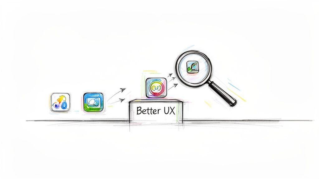
In the race to build a standout app, a great user experience is your most powerful advantage. A structured UX competitor analysis is what gets you there. It pulls your team out of the world of assumptions and into the reality of what actually works for users, what drives them crazy, and where the real opportunities are hiding.
Think of it as a reconnaissance mission. Before you pour resources into a new feature or a major redesign, you need to understand the battlefield. By carefully evaluating competitor products, you're gathering critical intelligence that will directly shape every stage of your development.
Sidestep Costly Design Flaws
One of the quickest wins from a UX competitor analysis is learning from someone else's mistakes. When you see a rival's confusing checkout process, a clunky onboarding flow, or an unintuitive menu, you get a clear map of what not to do. This simple act of observation saves an incredible amount of time and money, preventing you from building the same flaws that are already pushing users away elsewhere. For a deeper look at the fundamentals, understanding the key differences between UX and UI design in 2022 can add valuable context.
A thorough UX competitor analysis isn't about copying features. It's about understanding the why behind a competitor's design choices to build something demonstrably better for your target audience.
Uncover Gaps and Strategic Opportunities
A solid analysis does more than just point out what’s broken; it shines a light on market gaps. Maybe your competitors are ignoring a specific user need, failing to serve a key demographic, or just lagging in areas like accessibility and performance. Finding these gaps helps you position your product as the clear and superior solution, giving you a compelling value proposition that pulls customers in and keeps them there.
This is especially powerful when looking at AI integration. Digging into a competitor's AI features might reveal some big openings:
- Slow response times: Their chatbot or recommendation engine is sluggish, killing the user experience.
- Generic outputs: The AI gives one-size-fits-all answers that don't feel personal or helpful.
- High operational costs: They might be using a massively expensive AI model for simple tasks, making it impossible to scale effectively.
At Wonderment Apps, we specialize in turning these kinds of competitive insights into a real advantage. Our proprietary prompt management system is built to put this intelligence to work—fast. It lets developers build and deploy AI features that are quicker, more context-aware, and far more cost-effective. We do it by optimizing prompts, managing parameters, and keeping a tight grip on spending. This approach takes a competitor's weakness and turns it into your product's standout feature, ensuring you don't just compete, you lead.
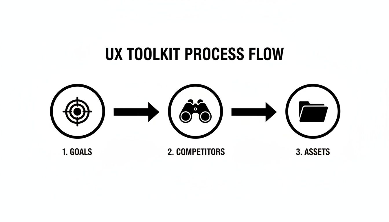
Building Your UX Analysis Toolkit
Before you dive headfirst into your competitors' products, you need a solid game plan. A successful UX competitor analysis isn't some random treasure hunt; it's a structured investigation with a clear purpose. If you just start poking around without a map, you'll quickly drown in a sea of screenshots and half-baked notes.
Taking the time to organize your approach is arguably the most critical part of the entire process. It’s what transforms your analysis from a simple review into a strategic tool that directly informs your product roadmap. The goal here is to be methodical, not just busy.
Define Your Analysis Goals
First things first, you have to ask a simple but powerful question: What are we actually trying to learn?
Without a clear objective, your analysis will wander aimlessly. Your goals need to be specific, measurable, and tied directly to a real business or product challenge you're trying to crack.
For instance, don't just say, "See what competitors are doing." That's too vague. Get specific.
- Instead of that, try: “Identify best-in-class onboarding flows to reduce our app’s user drop-off rate by 15% in the next quarter.”
- Or maybe: “Analyze checkout process usability to find concrete opportunities for decreasing our cart abandonment.”
- Even better: “Benchmark AI-powered search features to understand the speed and relevance standards our users now expect.”
Clear goals act as your filter. They help you zero in on the parts of a competitor's UX that truly matter to your project right now, keeping you from getting distracted by shiny features that are ultimately irrelevant to your mission.
Select Your Competitors Wisely
Not all competitors are created equal, and analyzing the right mix is crucial for getting a well-rounded perspective. A common mistake I see teams make is looking only at the companies that do exactly what they do. To get the full picture, you need to think a bit broader and categorize your rivals.
A well-rounded analysis includes a mix of direct, indirect, and aspirational competitors. This 360-degree view helps you understand both immediate threats and the broader user expectations shaping your industry.
I recommend creating a shortlist of three to five companies, making sure you have a balance across these key categories:
-
Direct Competitors: These are the obvious ones. They offer a very similar product to the same target audience. If you have a fintech app for budget tracking, this is another budget-tracking app. Think Mint vs. YNAB.
-
Indirect Competitors: These companies solve the same core user problem, but they do it with a different solution. For that same fintech app, an indirect competitor could be a traditional bank's mobile app that has a built-in budgeting feature, or even a popular spreadsheet template from a finance influencer. They’re competing for the same user need, just coming from a different angle.
-
Aspirational Competitors: Here’s where it gets interesting. These are companies completely outside your immediate industry that are just famous for their world-class user experience. Think of how Airbnb nailed the booking experience or how Duolingo perfected user engagement through gamification. Analyzing them helps you borrow proven, best-in-class UX patterns that can seriously elevate your own product.
Gather Your Essential Assets
Once your goals are set and you’ve picked your players, it's time to gather the raw materials. Getting organized at this stage will save you hours of backtracking later. I like to create a centralized folder for each competitor and start collecting the essentials.
Here’s a quick checklist of what you should grab:
-
Screenshots and Recordings: Systematically capture every step of key user flows. Don't just grab a few screens—record the entire process of signing up, completing a core task, or trying to contact support. Screen recording tools like Loom or QuickTime are invaluable for this.
-
App Store and Public Reviews: Scour reviews on platforms like the App Store, Google Play, G2, and Capterra. This is a goldmine of unfiltered user feedback. You'll quickly see what people love and, more importantly, what drives them crazy.
-
Marketing Materials: Check out their website, social media presence, and any help documentation or tutorials. This gives you critical context on how they position their product and explain its features to users. It’s their side of the story.
-
Performance Data: Use web performance tools to get a baseline understanding of their app's load times and responsiveness. A beautifully designed app that’s painfully slow is a huge UX weakness—and a potential opportunity for you.
Core Methods for Evaluating Competitor UX
Alright, you’ve defined your goals and picked your competitors. Now it's time to roll up your sleeves and actually dig in. This is where we move from planning to practice, using proven methods to systematically figure out what your rivals are doing right—and where they’re missing the mark.
Think of yourself as a detective. You wouldn't just glance at a crime scene; you'd dust for prints, analyze the evidence, and piece together what happened. Each method we'll cover is a different tool in your investigative kit, designed to uncover specific clues about a competitor's strategy and execution.
Before you jump in, having a clear process is key. It ensures you’re not just randomly clicking around but are focused and efficient.
This structured approach makes sure the detailed methods you're about to use lead to findings that are relevant and, most importantly, actionable.
Conduct a Heuristic Evaluation
One of the best places to start is with a heuristic evaluation. It sounds intimidating, but it’s just a fancy term for an expert review using a checklist of established usability principles, or "heuristics." You're essentially scoring a competitor's interface against a set of rules for good design to spot obvious flaws.
These principles cover fundamentals like:
- Visibility of system status: Does the app keep users informed about what’s going on? Think loading indicators or upload progress bars.
- User control and freedom: Can users easily undo a mistake or back out of a process they didn't mean to start?
- Consistency and standards: Does the product use the same language, icons, and layouts throughout? Users shouldn't have to learn a new pattern for every section.
- Aesthetic and minimalist design: Is the interface cluttered with information that distracts from the user's primary goal?
Going through a competitor’s product with this kind of checklist helps you quickly pinpoint common usability issues. This isn't about your personal opinion; it's about identifying objective violations of design principles that are almost certainly causing user frustration. For a deeper dive, our guide on the essentials of usability testing for a website is a great resource.
Map Out Critical Task Flows
Next, you need to understand how users actually do things in a competitor's product. A task flow analysis is where you map out the step-by-step journey a user takes to complete a core action—like signing up, making a purchase, or finding specific information.
The idea is to visualize their entire user journey, documenting every single screen, click, and decision point along the way.
For instance, if you were analyzing a rival fintech app’s onboarding process, you’d map it out like this:
- Screen 1: Download and open the app.
- Screen 2: Create account with email/password.
- Screen 3: Verify with two-factor authentication.
- Screen 4: Get prompted to link a bank account.
- Screen 5: Receive a success confirmation message.
Laying it out visually makes friction points jump out. Maybe their process takes seven steps to accomplish something your app could do in three. Or perhaps you’ll find a confusing button or a dead end that forces users to start over. This method makes friction tangible.
Build a Feature Comparison Matrix
A feature comparison matrix is a simple but incredibly powerful tool for seeing where you stand. It's just a table where you list key features down the side and your product and your competitors across the top. Then, you simply go through and check off who has what.
But a really good matrix goes beyond a simple checkmark. Instead of a "yes" or "no," consider using a rating system (like basic, advanced, not available) or adding a column for brief notes on the quality of their execution.
Here is a basic template to get you started:
| Feature | Your Product | Competitor A | Competitor B (Direct) | Competitor C (Indirect) |
|---|---|---|---|---|
| User Onboarding | ||||
| Core Feature 1 | ||||
| Core Feature 2 | ||||
| Notification System | ||||
| Customer Support | ||||
| Pricing Tiers |
This table allows for a quick, at-a-glance view of the competitive landscape.
This isn't just a feature inventory. It's a strategic tool to identify market standards, uncover underserved needs, and find opportunities to differentiate your product by offering something unique or executing a common feature exceptionally well.
Building on this, knowing how to conduct competitive analysis in a structured way is key to turning these matrices into winning strategies.
In the cutthroat world of ecommerce, this level of detailed UX analysis is a game-changer. A poor user experience is a direct line to lost revenue. In fact, research from AWS shows that a shocking 35% of sales are lost due to bad UX, sending shoppers right to the competition. This proves that scrutinizing a rival’s checkout flow isn’t just an academic exercise—it’s a direct path to reducing your own cart abandonment rates.
Digging Deeper with Advanced Analysis
A good UX competitor analysis tells you what your competitors are doing. A great one tells you how well they're doing it. This is where you move past a simple feature-for-feature comparison and start uncovering the subtle, often invisible, details that separate a decent product from one users can't live without.
This isn't just about what happens inside the app. The real user experience starts way earlier—maybe with a Google search or a post on social media—and includes every interaction along the way. By getting into the weeds of performance, accessibility, and content, you start connecting technical choices to real-world business impact.
Performance Benchmarking Is a Competitive Sport
Let’s be honest: in a world of shrinking attention spans, speed is a non-negotiable feature. Performance benchmarking isn't just a task for the engineering team; it's a vital part of your UX analysis. When a competitor’s site or app is sluggish, that’s not a minor inconvenience for their users—it’s a golden opportunity for you.
You don't need a complex setup to get started. Simple tools like Google's PageSpeed Insights or GTmetrix can give you a quick, powerful snapshot of how you stack up.
- Load Time: How long does it take before the app is even usable? Even a few hundred milliseconds can be the difference between a happy user and a lost one.
- Time to Interactive (TTI): This is often the metric that matters most. When can someone actually start clicking buttons and getting things done?
- Responsiveness: How quickly does the interface react when a user taps, swipes, or clicks? A laggy animation or slow search result makes a product feel cheap and unreliable.
By measuring these key metrics, you can pinpoint exactly where competitors are making their users wait. Those moments of friction are your openings to deliver a noticeably faster, smoother experience.
Accessibility Audits Uncover Untapped Markets
An accessibility audit is easily one of the most powerful—and most overlooked—parts of a UX competitor analysis. It’s a deep dive into how well a competitor's product works for users with disabilities, like those who depend on screen readers or can't use a mouse.
This is much bigger than just checking compliance boxes; it's about market share. Roughly 16% of the global population lives with a significant disability. If your competitors aren't building for them, they are willingly ignoring a huge slice of the market.
A competitor’s lack of accessibility is more than a design flaw; it's a strategic blind spot. By building an inclusive product, you can capture a loyal audience that your rivals have completely overlooked.
Running an accessibility check on a competitor means looking for fundamentals like:
- Proper color contrast for easy reading.
- Alt text on all important images.
- Full support for keyboard-only navigation.
- Clear, descriptive labels on all forms and buttons.
Content Audits Reveal Persuasion Strategies
How do your competitors talk to their users? What story are they telling to attract, educate, and convert them? A content audit is how you find out. It’s a systematic review of everything from their marketing copy and blog posts to their help docs and in-app notifications.
You’re trying to decode their strategy by analyzing:
- Tone and Voice: Are they buttoned-up and corporate, or casual and friendly? Does their language actually connect with their target audience?
- Value Proposition: Look at their homepage or app store description. How do they sell themselves? What makes them sound special?
- Educational Content: Do they have guides, tutorials, or blog posts? This kind of content builds trust and positions them as an authority in the space.
A content audit reveals the narrative your competitors are pushing. Once you understand their story, you can craft a much more compelling one for your own product. This adds a crucial layer of context to the task flows you’ve already mapped out, a topic we explore more in our guide on the best practices for creating powerful user flows.
To get even deeper, you can use modern tools to find out what customers are really saying. Techniques like AI survey analysis can process thousands of customer reviews at scale, revealing patterns you'd never spot manually. This level of detail is becoming the norm as UX budgets grow—in fact, 42% of companies in fields like healthcare and SaaS are reporting 10-30% year-over-year increases in UX spending. They're investing in this kind of analysis because it leads directly to better user satisfaction and higher conversions. You can find more on these UX spending trends in the full Userlytics report.
Turning Raw Data into Actionable Insights
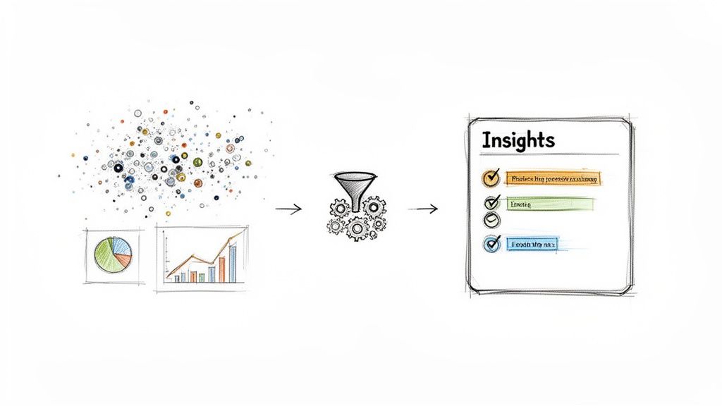
So, you’ve done the deep dive. You're sitting on folders packed with screenshots, performance metrics, and detailed notes on competitor task flows. Right now, it’s just a mountain of raw data. The real magic happens in the synthesis—turning that pile of observations into a clear, compelling story that tells your team exactly what to do next.
A list of findings is interesting, but a narrative is what actually drives action. Your goal here is to move beyond simply stating, "Competitor A has a three-step checkout." You need to build a case: "Competitor A's three-step checkout is faster and less confusing, which is likely why our cart abandonment rate is higher. Here's how we can fix it." This is how you transform raw data into a strategic asset.
Using Frameworks to Find the Story
To build this narrative, you need to bring some structure to the chaos. Just sifting through data randomly is a recipe for getting lost. This is where simple, proven frameworks can help you organize your findings and start spotting the patterns that matter.
One of the most effective tools for this is a classic with a UX twist: the SWOT analysis. Standing for Strengths, Weaknesses, Opportunities, and Threats, it forces you to categorize findings in a way that naturally leads to strategic conclusions.
- Strengths: What does the competitor do exceptionally well from a UX standpoint? Is their onboarding flow seamless? Is their mobile app incredibly intuitive?
- Weaknesses: Where do they stumble? Maybe their search function is clunky, or their help documentation feels like a complete afterthought. (Pro tip: 1-star reviews are a goldmine for finding these).
- Opportunities: Looking at their weaknesses, where are the market gaps you can exploit? If their AI chat is slow and generic, that’s a huge opening for you to build a faster, more helpful one.
- Threats: What are they doing so well that it poses a direct threat to your market share? Are they rolling out features that make your core offering look dated?
This framework isn't just an organizational tool; it's a storytelling engine. It helps you frame your analysis in terms of strategic advantage, making it so much easier to communicate your findings and get buy-in from your team.
Creating Scoring Matrices for Objective Comparisons
While a SWOT analysis is brilliant for qualitative insights, sometimes you need cold, hard numbers to make your point. This is where a scoring matrix becomes your best friend. It’s a straightforward way to objectively rank your competitors on key aspects of their user experience.
The process is pretty simple:
- Define Your Criteria: Pick the UX attributes that are most critical for your product. This could be anything from onboarding friction and task completion ease to design aesthetics or information clarity.
- Set a Scoring Scale: Use a simple scale, like 1 to 5, where 1 is "Poor" and 5 is "Excellent."
- Score Each Competitor: Go through your list of criteria for each competitor and assign a score based on your research.
- Calculate Totals: Add up the scores to see who really comes out on top.
This simple exercise transforms subjective feelings ("their app feels clunky") into objective data ("they scored a 2/5 on task completion ease"). It gives you a clear, at-a-glance summary of the competitive landscape and helps you prioritize where to focus your own improvements. When you can show stakeholders that your top two competitors are outscoring you on onboarding, it builds a much stronger case for prioritizing that work.
This kind of detailed UX competitor analysis isn't just for tech startups anymore; it’s fueling strategic shifts everywhere, including government and nonprofits, where 70% of organizations plan to hire more UX professionals. For SaaS and fintech, the stakes are even higher—a full 77% of brands now call customer experience their main differentiator. The investment clearly pays off: every dollar spent on UX is shown to return a staggering $100. You can discover more about the growing impact of competitor research in the 2025 UX edition guide.
From Analysis to a Winning Product Strategy
Okay, this is where all your hard work collecting data and digging for insights really pays off. It's time to take what you've learned and shape it into a product strategy that actually drives the business forward. The final, and most critical, step is presenting your UX competitor analysis in a way that gets immediate buy-in and gives your team a clear path to follow.
Let's be honest: dropping a dense report into someone's inbox is the fastest way to get it ignored. Your job is to tell a story. You need to connect the dots between a competitor’s clumsy UX and a real, tangible business opportunity for your product.
Presenting for Maximum Impact
If you want your recommendations to get the green light, you have to speak the language of business outcomes. Frame every insight around the metrics your stakeholders genuinely care about, like customer retention, conversion rates, and operational efficiency.
You have to make your findings easy to digest. Here are a few ways we do it:
- Dashboards: Build a simple, one-page dashboard that shows the key competitive scores at a glance.
- Prioritized Roadmaps: Don’t just throw a list of opportunities at them. Rank everything by potential impact versus the effort required. It shows you've thought it through.
- Highlight Reels: Use short video clips or a few heavily annotated screenshots. Actually show them where a competitor’s experience falls apart. It’s far more powerful than just telling them.
This is exactly how our Managed Projects teams at Wonderment Apps operate. We don’t just point out problems; we build and present a clear, prioritized path forward, turning deep analysis into superior apps that deliver results you can measure.
The goal of your presentation isn't just to inform; it's to persuade. A great presentation makes the proposed product changes feel like the obvious, inevitable next step for the business.
Turning Competitive Gaps into Your Advantage
Your UX competitor analysis is the perfect blueprint for innovation, especially if you're looking to modernize your application with AI. Those gaps you found in a competitor's AI features? They aren't just weaknesses—they're your roadmap to building something decisively better.
This is where having the right tools becomes a game-changer. Our AI modernization toolkit at Wonderment Apps is built to attack these exact competitive gaps. Our prompt management system, for instance, is an administrative tool that lets your development team rapidly create and fine-tune prompts that deliver incredibly context-aware and personalized AI interactions.
By plugging our tool into your existing app, you gain a massive advantage. The system includes a prompt vault with versioning to track what works, a parameter manager for secure access to your internal database, a comprehensive logging system across all integrated AIs, and a cost manager that gives you a real-time view of your cumulative AI spend. You can build sophisticated AI experiences that flat-out outperform the competition, building an app that doesn't just compete—it wins for many years to come.
Ready to turn your competitive insights into a market-leading application? Wonderment Apps specializes in AI modernization and building superior digital products that scale to meet any user audience. Let's build a product that delights users and leaves your competition in the dust.
Schedule a demo of our AI modernization toolkit today at https://wondermentapps.com.