Web page usability testing is simply the practice of watching real people interact with your website. The whole point is to spot friction points and find opportunities to make things better. It forces you to move beyond your own assumptions and gives you direct insight into how people actually experience your digital product. This is an absolutely essential process if you want to create a web experience that's intuitive, effective, and just plain user-friendly.
At Wonderment Apps, we've seen firsthand how these insights are the secret ingredient to building smarter, AI-powered software that users love. To that end, we've even developed a prompt management system—an administrative tool that helps developers and entrepreneurs plug AI into their existing apps. By observing users, you learn exactly where to integrate AI to solve real problems, and our tool helps you manage that process seamlessly. We’ll touch on this a bit more later.
Why Usability Testing Drives Modern Business Growth
In today's market, a clunky or confusing website isn't just a minor annoyance—it's a direct leak in your revenue pipeline. A frustrating experience sends potential customers running straight to your competitors. This is where web page usability testing stops being a technical task and becomes a core business strategy. It’s all about understanding the human side of your technology to drive tangible results.
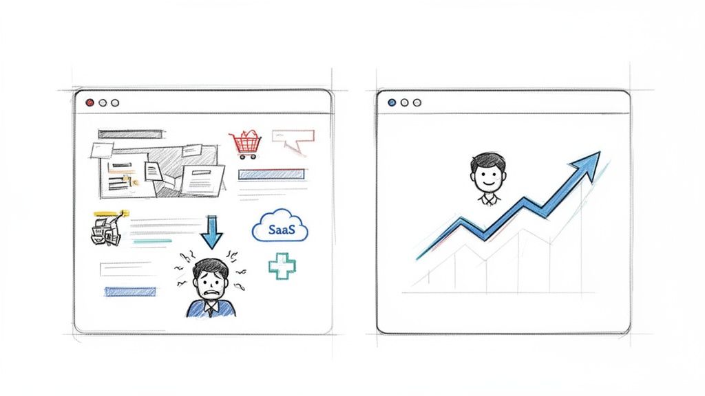
Think about the last time you abandoned an online shopping cart. Was it because you couldn't find the checkout button? Or maybe a SaaS platform’s signup form was so convoluted you just gave up. These aren't isolated incidents; they're symptoms of poor usability. By watching real users try to navigate these exact scenarios, you uncover the "why" behind your bounce rates and drop-offs.
Connecting User Experience to Your Bottom Line
Every single business, no matter the industry, benefits from a smoother user journey. The link between good usability and a healthy bottom line is direct and surprisingly easy to measure.
- Ecommerce: A simplified checkout process can dramatically slash cart abandonment rates. For instance, discovering that users are struggling to apply a discount code is an easy fix with a massive ROI.
- SaaS: For software companies, usability testing can shine a light on friction in the onboarding process. Smoothing out those critical first few interactions is the key to converting trial users into loyal paying customers.
- Healthcare: In a field where trust is everything, a clear and accessible patient portal builds confidence. Testing ensures that users can easily find their test results or book appointments, which goes a long way in strengthening patient loyalty.
Despite these obvious benefits, a surprising number of companies are still flying blind. Research shows that only 55% of businesses conduct any kind of regular UX testing. Yet, the ones that do see significant gains. Ecommerce leaders investing in user experience report up to 88% higher return visits and avoid the staggering 70% abandonment rate often caused by poor mobile experiences. These figures point to a critical gap that proactive brands can easily take advantage of. You can dive deeper into the latest trends in MeasuringU's newest report.
Modernizing Your Application with User Insights
The insights you get from web page usability testing are also fundamental when you start modernizing your application with AI. It’s not enough to just tack on new technology; you have to ensure it actually enhances the user experience, rather than complicating it.
User feedback is the raw material for intelligent innovation. It tells you where an AI-powered chatbot could be most helpful or how a personalization engine can deliver real value without being intrusive.
This is exactly why we built our prompt management system here at Wonderment Apps. It’s designed to help businesses act on user insights to build smarter, more intuitive AI features. By testing how users interact with new AI functionalities, you can refine the prompts and parameters to create a truly seamless experience. This approach ensures your software not only scales to meet any audience size but also evolves with user expectations, building a product designed to last. To see how this fits into a broader strategy, check out our guide on competitive analysis in UX design.
Building Your Usability Test Plan
A great usability test never happens by accident. It's the direct result of a thoughtful, practical plan. Trying to run a test without a clear roadmap is like trying to build an app without a design—you’ll get something, but it probably won’t be what you wanted.
The goal here isn't to create a fifty-page document filled with academic jargon. It's to create an actionable plan that guides your entire process, from recruiting the right people to analyzing their feedback. Think of it as the single source of truth for your entire testing effort, keeping the team aligned on what you're trying to learn and why.
Define Your Goals And Objectives
Before you even think about writing a task, you need to know what success looks like. Your goals have to be specific, measurable, and tied directly to what the business actually cares about. Vague goals like "see if the site is easy to use" are a dead end. You have to dig deeper.
Ask yourself what you're really trying to achieve. Are you aiming to increase free trial sign-ups? Maybe you're focused on cutting down the number of support tickets related to a confusing feature.
Here are a couple of examples of strong, measurable goals:
- Business Objective: Increase Q3 revenue from new product sales.
- Usability Goal: Identify and remove at least three friction points in the new product's checkout flow to decrease cart abandonment by 15%.
- Business Objective: Reduce customer support overhead.
- Usability Goal: Determine if users can successfully find answers in our new knowledge base on their first attempt, aiming for an 80% success rate.
Goals like these provide clear targets. They make it much easier to measure the real-world impact of your test and transform usability testing from a simple checklist activity into a strategic tool for growth.
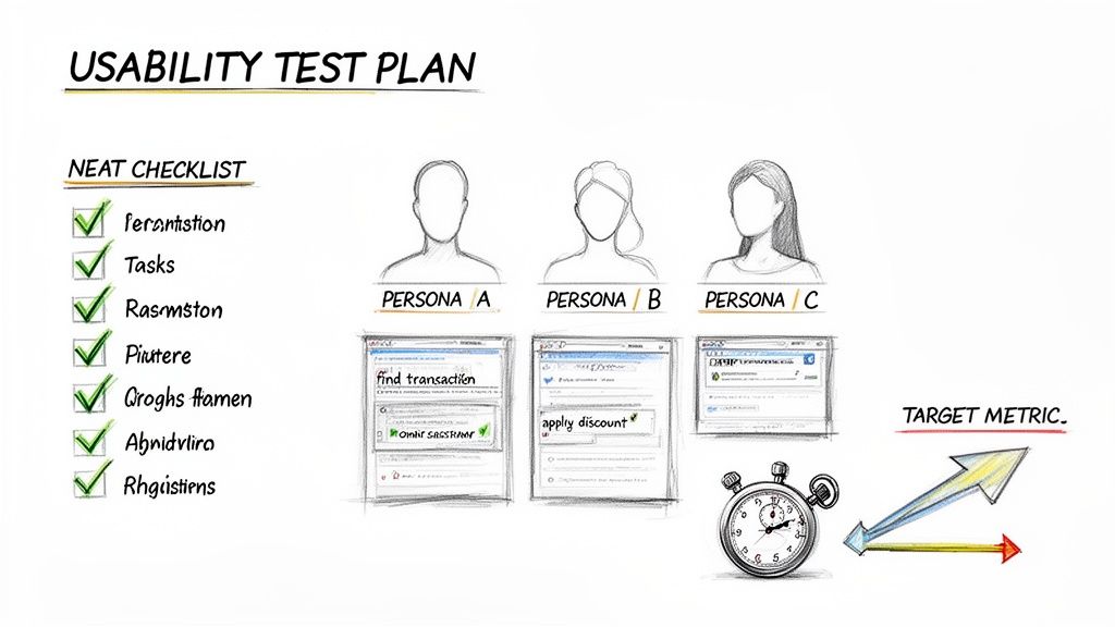
Identify Your Target User Personas
The insights you gather are only as valuable as the people you gather them from. Testing with the wrong audience will send you down a completely incorrect path, which is why defining your user personas is non-negotiable.
A user persona is a fictional character that represents your ideal customer, built from real data about their demographics, goals, motivations, and pain points.
Your test plan should specify which persona(s) you are targeting. This focus ensures the feedback you receive is relevant and comes from people who would actually use your product.
For instance, if you're testing a new feature for a fintech app aimed at Gen Z investors, your participants need to reflect that profile. Their comfort with digital tools and financial expectations will be worlds away from a retiree planning their estate. Getting this right is crucial. If you're designing user journeys for these personas, you can learn more about crafting powerful user flows in our detailed guide.
Craft Realistic User Tasks
This is where the rubber meets the road. User tasks are the specific actions you'll ask participants to perform on your website. The trick is to make them realistic scenarios, not just a list of clicks. They should feel like real-world situations your users would actually encounter.
You need to give users a goal but avoid telling them how to achieve it. You’re here to observe their natural behavior and thought process. As you build out your plan, exploring different user experience testing methods is vital for shaping tasks that effectively evaluate your product.
Good Task Example (Ecommerce):
"You've found a pair of running shoes you like and have a 20% off discount code. Go through the process of buying them and applying your code."
Bad Task Example (Ecommerce):
"Click on the 'Add to Cart' button, then go to the cart, find the promo code box, enter 'SAVE20', and click 'Apply'."
See the difference? The first example gives the user a scenario and a goal, letting you see if they can navigate the checkout process on their own. The second is just a set of instructions that tells you very little about the actual usability of your site.
Finding the Right People for Your Test
The insights you get from web page usability testing are only as good as the people you test with. It’s a simple truth: if you test with the wrong audience, you’ll end up solving the wrong problems. Let's dig into how to find users who genuinely reflect your true audience, making sure the feedback you gather is actually worth its weight in gold.
Recruiting doesn't have to be some complex, expensive nightmare. The real key is to be strategic and a little resourceful. You just need to focus on methods that connect you with people whose goals and behaviors line up with who you’re actually trying to reach. Nailing this step sets the stage for a test that delivers real, actionable insights.
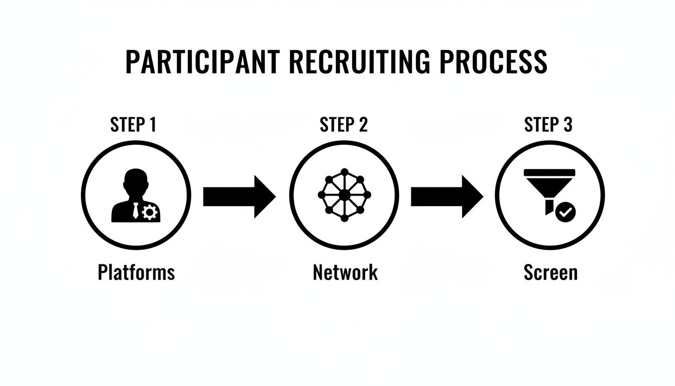
Where to Find Your Participants
There are a handful of different ways to find test participants, and each has its own quirks. The best game plan is usually a mix of strategies, depending on your budget, timeline, and how niche your target audience is.
Here are a few of the most effective recruiting channels I’ve used:
- Your Existing User Base: This is often the cheapest and fastest route. Tapping into your own email list or social media following connects you with people already familiar with your brand. Their feedback can be incredibly potent for making iterative improvements.
- Professional Recruiting Platforms: Services like UserTesting, UserZoom (now part of UserTesting), and Lyssna (formerly UsabilityHub) are built for this. They have huge panels of pre-screened people, making it easy to filter by demographics, tech-savviness, and other criteria. It’s a massive time-saver.
- Social and Professional Networks: Don't sleep on platforms like LinkedIn or niche, industry-specific forums. They can be absolute goldmines for finding users with very specific job titles or expertise, which is perfect if you’re working on a B2B or specialized SaaS product.
Remember, the goal isn't just to find any user; it's to find the right user. A small, hyper-focused group of five relevant participants will almost always give you more to work with than a bigger, more generic crowd.
Crafting an Effective Screener Survey
Okay, so you have a pool of potential candidates. Now what? You need a way to filter them, and that's where a screener survey comes in. A good screener is just a short questionnaire designed to weed out anyone who doesn't fit your target persona.
The trick is to ask questions that reveal behaviors and mindsets without giving away the "right" answers. This helps you dodge people who are just trying to say whatever it takes to qualify for the incentive. For example, instead of asking something obvious like, "Do you shop online for running shoes?" you can be a little more clever.
Example Screener Question:
"Which of the following have you purchased online in the last six months? (Select all that apply)"
- Running shoes
- Books or e-books
- Streaming service subscriptions
- Meal delivery kits
- Event tickets
- None of the above
This multiple-choice format lets you confirm the behavior you’re looking for without leading the witness.
Another pro tip is to include what experts call "foils"—fake but plausible answer options. This is a great way to catch people who are just clicking through without reading. For instance, if you're testing a project management tool, you could list a few real tools and one you completely made up. Anyone who selects the fake tool probably isn’t paying close enough attention. This simple technique, championed by usability gurus at the Nielsen Norman Group, drastically improves the quality of your recruits.
By carefully picking your channels and building a smart screener, you set your usability test up for success, ensuring it delivers clear, actionable, and game-changing insights for your product.
Running Your Usability Test Sessions Like a Pro
Alright, you've done the prep work. Your plan is solid, your participants are lined up, and now it’s time for the main event: running the actual test sessions. This is where all that planning pays off, turning your questions into firsthand observations of how real people interact with your site.
How you handle these sessions makes a huge difference in the quality of feedback you get. The first big fork in the road is deciding between moderated and unmoderated testing. Neither one is flat-out better than the other; the right call depends entirely on your project's goals, your timeline, and how deep you need to go.
Moderated vs Unmoderated Testing: What's the Difference?
Getting a handle on the core differences between these two approaches will help you match your testing strategy to your goals. One path gives you rich, qualitative stories, while the other delivers broader quantitative data at a much faster clip.
Before we dive into the methods, remember that both start with a solid recruiting process. You have to get the right people in the door (or on the screen) first.
This flow is your foundation. Once you have your screened participants ready, you can decide how you want to run the session with them.
Moderated Testing is a live conversation. A facilitator guides the participant through the tasks in real-time, either face-to-face or over a video call. This is my go-to for digging into complex features because you can ask follow-up questions and really get into a user's head.
Unmoderated Testing is the opposite—it happens without a live facilitator. Participants complete tasks on their own time, usually with software recording their screen and voice as they think aloud. It’s incredibly scalable and perfect for getting quick feedback from a large group.
Let's break down the practical differences to help you choose.
Moderated Versus Unmoderated Usability Testing
This table offers a practical comparison of the two main usability testing methods. Use it to help you choose the right approach for your project.
| Factor | Moderated Testing | Unmoderated Testing |
|---|---|---|
| Best For | Deep qualitative insights and complex tasks. | Quick feedback, simple tasks, and larger sample sizes. |
| Primary Benefit | Ability to ask follow-up "why" questions. | Speed, scale, and lower cost per participant. |
| Main Drawback | More time-consuming and expensive per session. | No ability to probe deeper or clarify user confusion. |
| Facilitator Role | Actively guides the session and builds rapport. | Sets up the test and analyzes results afterward. |
Ultimately, your choice sets the stage for success. Need to understand the subtle motivations behind how users interact with a brand-new, complex feature? Go with moderated. Just need to know if people can find the checkout button? Unmoderated will get you answers fast.
Facilitating a Great Moderated Session
If you choose moderated testing, your role as the facilitator is absolutely critical. Your main job is to create a comfortable, relaxed space where the participant feels safe enough to share their honest, unfiltered thoughts—especially the negative ones. Think of yourself as a neutral, curious guide, not their best friend.
Always start by building a little rapport. A few minutes of small talk can melt away any initial jitters. Most importantly, remind them that you're testing the website, not them. Make it crystal clear that there are no right or wrong answers. This simple act of framing gives them permission to be critical without feeling like they're failing a test.
The most powerful insights often come from moments of confusion or frustration. Your job is to make the user feel comfortable enough to voice those feelings out loud.
During the session itself, lean heavily on the "think aloud" protocol. Ask participants to narrate their thoughts as they move through each task. If they go quiet for a bit, a gentle prompt like, "What are you thinking now?" or "What's catching your eye on the page?" is usually all it takes to get them talking again.
The key is to ask open-ended questions that don't lead the user toward a specific answer. Instead of asking, "Was that button easy to find?" (which begs for a simple 'yes' or 'no'), try something like, "Tell me about your experience finding that button." This encourages a much richer, more detailed story.
For remote sessions, good tools are non-negotiable. Platforms like Zoom or Lookback are fantastic for screen sharing and recording. And for taking notes, a collaborative tool like Dovetail or even a simple shared Google Doc lets your team capture insights in real-time without distracting the participant. A smooth setup lets you focus entirely on what matters: the user.
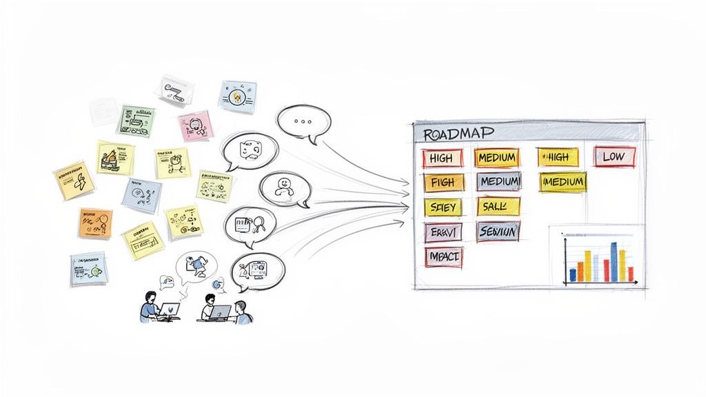
From User Feedback to Actionable Improvements
The easy part is over. After a round of web page usability testing, you’ll be sitting on a mountain of raw data—pages of notes, hours of recordings, and a ton of user quotes. The real work begins now: turning that pile of observations into a clear, prioritized list of product improvements that your team can actually act on.
This is where you connect the dots between what a user did and what your team needs to do next.
The analysis phase can feel like a slog, but it doesn't have to be. Your goal isn't to document every single sigh, hesitation, and mis-click. You're on a mission to spot the recurring patterns, get to the "why" behind what people are doing, and build a compelling case for change.
One of the most common mistakes I see is teams getting lost in the weeds. They try to analyze every minor detail and end up with paralysis. Keep your eyes on the big-picture insights that tie back to your original test goals.
Finding Patterns in the Chaos
First things first, you need to synthesize your findings. Get all your observers in a room (virtual or physical), gather their notes, and start reviewing the session recordings together. A fantastic way to tackle this collaboratively is a technique called affinity diagramming.
It sounds fancy, but it’s really just a simple, powerful way to group related observations using sticky notes.
You might end up with clusters of notes around themes like:
- "Users struggled to find the shipping information."
- "Multiple participants were confused by the pricing tiers."
- "The 'Apply Coupon' button was hard to see on mobile."
This simple exercise helps you move beyond individual comments to see the broader, more impactful themes. As you start grouping the notes, you’ll quickly see which issues popped up again and again. These recurring problems are your gold mine.
Prioritizing What to Fix First
Once you’ve identified the key themes, you can't just dump them on your development team and walk away. You have to prioritize. This means sorting the issues by their real-world impact on the user experience.
A simple but incredibly effective way to do this is to categorize each problem by its severity.
You can use a straightforward scale to bring order to the chaos:
- Critical: A problem that completely stops a user from completing a key task. Think: they physically can't check out. This is an all-hands-on-deck, drop-everything kind of fix.
- Serious: An issue that causes major frustration but doesn't completely block the user. For instance, the site search keeps returning totally irrelevant results.
- Minor: A small annoyance that detracts from the experience but doesn't really slow the user down, like a typo or an inconsistent icon.
By categorizing issues, you can focus your team's energy where it matters most. Fixing a single critical issue is often more valuable than fixing ten minor ones.
Using a framework like this instantly moves the conversation away from opinion-based debates and toward a data-driven discussion about what will deliver the most value to both your users and the business.
Building a Persuasive Case for Change
Your final job is to transform your findings into a story that inspires your team to take action. Don't just hand over a dry list of problems. You need to combine your qualitative feedback with any quantitative data you have to build a powerful, persuasive narrative.
Instead of just saying, "Users didn't like the checkout button," frame it with real-world impact:
"Four out of five participants struggled to find the checkout button on mobile, with an average delay of 45 seconds. This hesitation directly contributes to our 30% mobile cart abandonment rate. By making the button more prominent, we can create a smoother path to purchase."
See the difference? This approach connects the usability issue directly to a business metric, making it much easier to get buy-in from stakeholders. Present your findings with short video clips of users struggling, compelling quotes, and crystal-clear recommendations. Your report should feel less like a technical document and more like a guide showing your team exactly how to make the product better for everyone.
Using User Insights to Build Smarter AI Features
This is where the rubber meets the road—where your hard-earned web page usability testing insights fuel real innovation. The qualitative data you've gathered is an absolute goldmine for informing the next generation of smarter, more personalized AI-driven software experiences. Every nugget of user feedback helps you connect the dots between what your audience actually needs and what your technology can deliver.
Your findings will tell you exactly where an AI-powered chatbot would be most helpful or how a personalization engine can add genuine value without feeling creepy or intrusive. This direct line into the user's mindset is what separates a truly intelligent application from one that just has technology bolted on as an afterthought.
Turning Feedback Into Intelligent Features
At Wonderment Apps, we built our entire prompt management system around this very idea. It’s an administrative tool we designed to help developers and entrepreneurs act on user feedback and rapidly iterate on AI features. This is how you build an application that not only works but actually evolves with your users.
Our system has a few key pieces that translate those user insights directly into action:
- A Prompt Vault with Versioning: When testing reveals that an AI chatbot is giving confusing answers, you can instantly tweak the prompt, test a new version, and roll it back if needed—all without rewriting a single line of code.
- A Parameter Manager: If users find your AI-powered product recommendations irrelevant, you can easily adjust the parameters that access your internal database to refine the logic. This ensures suggestions are always on point.
- Integrated Logging: You get a complete history of interactions across all integrated AIs. This lets you analyze user behavior patterns and pinpoint exactly where the AI experience is falling short.
Making AI-Powered Innovation Sustainable
One of the biggest hurdles for any entrepreneur is managing the often unpredictable costs of AI. That's why our platform includes a built-in cost manager that gives you total visibility into cumulative spending. This transparency makes innovation sustainable, letting you experiment and refine features without constantly worrying about runaway expenses.
This approach also directly tackles critical accessibility and performance issues. Recent accessibility benchmarking revealed that top websites average a staggering 51 detectable errors per page, a huge barrier for many users. For businesses in ecommerce or healthcare, these usability gaps can be devastating, contributing to the 90% of app abandonment caused by poor performance. Weaving usability test findings into your process early helps you build a credible, user-centered product from the ground up.
When you start with real user problems, your AI features will naturally deliver real solutions. To dive deeper into this methodology, check out our guide on how to leverage artificial intelligence to modernize your software. This is how you build an application that feels intelligent, intuitive, and truly built to last.
Your Usability Testing Questions, Answered
If you're diving into web page usability testing, you're bound to have some questions. It's a field with a lot of nuance. Let's tackle some of the most common ones we hear from teams just like yours.
How Many Users Do I Really Need to Test?
This is the big one, and the answer might surprise you. You don't need to recruit an army of testers to get game-changing insights.
Landmark research has shown that testing with just 5 users is often enough to uncover about 85% of the major usability hurdles on your site. The goal here is quality feedback, not just a massive quantity of it.
Now, if you're working on a highly complex application or a platform with very distinct user groups (say, buyers vs. sellers), you might want to expand that number. In those cases, running a couple of separate tests with 5 users each can help you spot the more subtle issues specific to each group without getting bogged down in repetitive feedback.
What’s the Difference Between Usability Testing and A/B Testing?
It’s easy to mix these two up, but they solve different problems. Think of it like this: usability testing is about the why, and A/B testing is about the what.
Usability testing is qualitative. You're watching real people interact with your site to understand why they get stuck, what confuses them, and where they get frustrated. It’s about uncovering the friction points in the user journey through direct observation and feedback.
A/B testing, on the other hand, is purely quantitative. It pits two versions of a page against each other to see which one performs better on a single, specific metric, like click-through rate. A/B testing can tell you that "Version B won," but usability testing is what tells you why Version B was more intuitive or compelling to users.
How Often Should We Be Doing This?
Usability testing isn't a "one-and-done" activity you check off a list right before a big launch. To get the most out of it, you need to weave it into your entire development process.
Treat usability testing as a continuous loop, not a final exam. Test early with wireframes, test again before a feature goes live, and keep testing periodically on your live site. This iterative approach helps you catch problems when they're still small and cheap to fix, leading to a constantly improving user experience.
If you have more technical questions about the development side of things, the comprehensive amino FAQs is another great resource to check out.
Ready to turn user feedback into smarter, more intuitive AI features? Wonderment Apps provides the tools and expertise to modernize your software. See how our prompt management system can help you build an application that scales with your audience and is built to last.