
Your app is live. Users are signing up, placing orders, finishing tasks, and doing just enough that the product looks healthy from a distance.
Then the flatline starts.
Growth slows. Support gets the same fuzzy complaints over and over. Stakeholders hear that the app is “kind of confusing” or “difficult to use,” but nobody can point to one obvious defect. Engineering fixes bugs. Marketing tweaks messaging. Product ships more features. The metrics barely move.
That’s the moment ux audit services become useful. Not as a design nicety, and not as a rebrand ritual. As diagnosis.
When Good Apps Face Invisible Barriers
The hardest UX problems usually aren’t dramatic. They’re cumulative.
A button label that doesn’t match the next screen. A checkout step that asks for information too early. A dashboard that looks polished but forces users to stop and think. None of those issues sounds catastrophic in isolation. Together, they create drag that slows conversion, weakens retention, and chips away at trust.
Why teams miss the underlying problem
Many teams initially examine the wrong layer.
They look for broken features, not broken flows. They watch top-line analytics, not where intent turns into hesitation. They ask whether the interface works, when the better question is whether the product helps users keep momentum.
A UX audit catches that difference.
It looks at the product as a system. Navigation, information hierarchy, interaction patterns, copy, page states, accessibility, behavioral signals, and the handoff points between them. That’s why an audit can explain why a product feels harder to use than the roadmap suggests it should.
Good apps rarely stall because of one terrible screen. They stall because friction is distributed across the whole experience.
Why ux audit services are growing fast
Businesses are treating UX less like decoration and more like operating infrastructure. That shift shows up in the market. The global UX services market is projected to grow from USD 8.80 billion in 2026 to USD 77.18 billion by 2034, at a CAGR of 31.20%, according to Fortune Business Insights.
That projection matters because it reflects how teams now evaluate digital products. If experience quality influences conversion, loyalty, and support load, then auditing the experience becomes a business discipline, not a design exercise.
The new wrinkle is AI
The invisible barrier gets harder to diagnose once AI enters the product.
Personalized recommendations, smart search, assistant workflows, dynamic onboarding, and prompt-driven interfaces can create a polished front end while hiding messy logic underneath. A user may see “helpful personalization,” but experience churn can start much earlier. A recommendation arrives at the wrong moment. A generated answer is technically accurate but poorly framed. A prompt chain introduces latency, inconsistency, or compliance risk.
Traditional audits can catch some of that. They cannot explain all of it.
Modern ux audit services need to inspect not only screens and flows, but also the decision logic shaping those flows. In AI-powered products, that includes prompt behavior, fallback states, logging, cost visibility, and whether the system’s “smart” layer is helping users or making the experience stranger.
What Is a UX Audit Really
A UX audit is a structured inspection of an existing digital product. It tells you where users struggle, why they struggle, and which fixes deserve priority.
It is not a redesign. It is not a few stakeholder opinions gathered into slides. It is not the same thing as usability testing, though testing can support it.
Consider it a building inspection for software. You don’t hire an inspector to repaint the walls. You hire one to tell you whether the structure is sound, where the risks are, and what should be fixed before you expand the property.

What an audit is not
A lot of confusion comes from teams using “audit” to describe several different activities.
Here’s the clean distinction:
| Activity | What it does | What it does not do |
|---|---|---|
| UX audit | Diagnoses friction across flows, screens, behavior, and structure | It doesn't replace implementation |
| Usability testing | Observes how users complete tasks | It doesn't always give a full product-wide diagnosis |
| Redesign | Changes interface and interaction patterns | It shouldn't begin before diagnosis |
| Analytics review | Shows where users drop off | It rarely explains the full why on its own |
That last point matters. Analytics can tell you users leave on a certain page. An audit explains whether they leave because the page loads the wrong information, asks for too much commitment, breaks expected patterns, or creates doubt.
If you want a useful companion read on adjacent evaluation work, Wonderment’s piece on https://www.wondermentapps.com/blog/ux-testing-services/ is a solid way to separate testing from broader UX analysis.
What a good audit gives your team
The deliverable should feel practical, not academic.
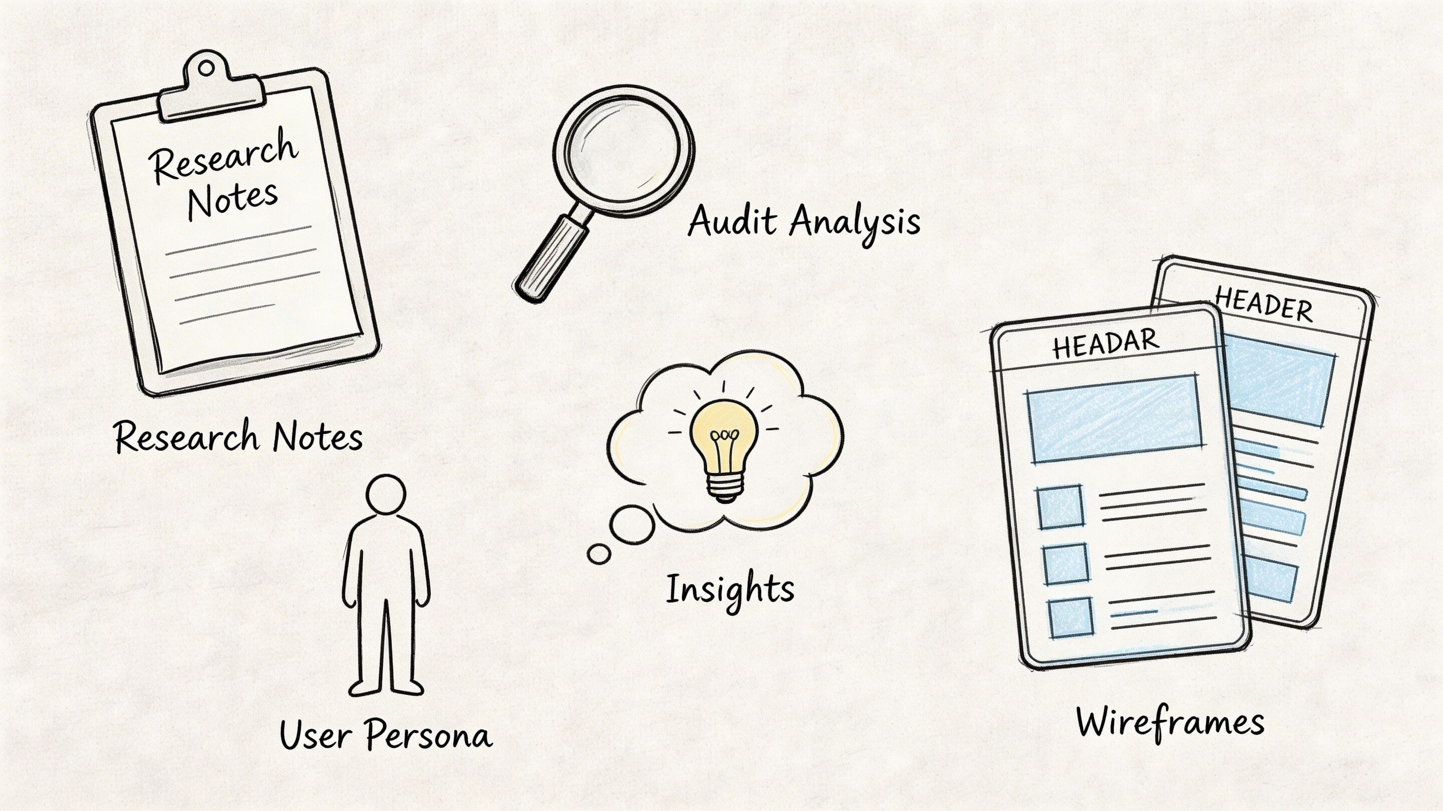
A real audit usually includes:
- Mapped priority flows such as sign-up, onboarding, checkout, search, upgrade, and support deflection
- Annotated findings with screenshots that show exactly where friction occurs
- Severity levels so teams know what is critical, what is important, and what can wait
- Business impact framing that ties issues to conversion, retention, trust, or operational overhead
- Recommended next actions that product, design, and engineering can schedule
That’s where many internal reviews fall apart. They generate observations, not decisions.
Practical rule: If an audit report doesn't help a product manager sort work into the next sprint, it isn't finished.
Why this matters before a redesign
Teams often jump into redesign mode too early. That creates expensive motion.
A redesign without an audit can polish the wrong thing. It can also create fresh problems by changing layouts and flows before the team understands which issues are cosmetic and which ones are structural. If you want a conversion-minded perspective from the marketing side, this guide to a website audit that boosts revenue is useful because it connects evaluation work to business outcomes rather than aesthetics.
A UX audit slows the team down in the right way. It gives you evidence before effort.
The Auditor's Toolkit Methods and Deliverables
A good audit isn’t magic. It’s a disciplined stack of methods used in the right order.
Strong auditors don’t open a product and start “giving feedback.” They gather evidence from several angles, compare patterns, and then translate those findings into a roadmap a team can act on.
Heuristic review
This is one of the core methods in professional ux audit services.
Expert auditors evaluate the interface against Nielsen’s 10 Usability Heuristics, and designs that violate those principles can lead to 40 to 60 percent higher task abandonment rates, according to Cardinal Peak. That’s why experienced auditors look for familiar failure patterns such as inconsistent labels, weak system feedback, poor error prevention, and missing user control.
A heuristic review is especially useful when a product looks polished but still feels harder to use than it should.
Typical findings include:
- Inconsistent navigation that forces users to relearn paths between sections
- Weak feedback loops where the system doesn’t clearly confirm progress or failure
- Preventable errors caused by ambiguous inputs, unclear form states, or hidden constraints
- Broken expectations where labels, icons, or CTAs suggest one outcome and deliver another
Analytics review
Heuristics find pattern violations. Analytics shows where those violations become measurable friction.
An auditor usually studies product data across the highest-value flows. That often includes sign-up, onboarding, account setup, search refinement, checkout, subscription upgrade, and support journeys. Tools vary by stack, but Google Analytics, session replay tools, event logs, and funnel tracking are common inputs.
This review looks for things like:
| Signal | What it often suggests |
|---|---|
| Sudden drop-off in one step | A clarity or trust problem |
| Repeat clicks on a non-clickable element | A false affordance |
| Back-and-forth navigation | Confusion in information architecture |
| High exits from a form or setup stage | Friction, cognitive load, or premature demand |
For ecommerce teams, a specialized resource like this complete Shopify CRO audit framework can complement a UX lens by showing how conversion-focused audits break down store performance in practice.
Flow mapping and task analysis
Some of the worst friction only becomes obvious when you map the end-to-end path.
Auditors trace the major tasks a user tries to complete and inspect every handoff. That includes the moment a user enters a flow, the decisions they have to make, the information they need, and the points where confidence can drop.
Often, “fine” products reveal process debt at this point. A journey may be logically complete but still ask users to work too hard.
For teams that want to understand how observed behavior fits into this process, Wonderment’s article on https://www.wondermentapps.com/blog/usability-testing-of-a-website/ is a useful companion.
Accessibility and technical UX review
A thorough audit also checks whether the product is usable across real-world contexts.
That means auditors review accessibility basics, responsive behavior, interaction states, content clarity, and the technical conditions that shape the experience. Slow loading, unstable integrations, awkward mobile transitions, and unclear error handling often show up here.
This work matters because users don’t experience “design” separately from performance. They experience one product.
The fastest way to waste an audit is to stop at screenshots. Real friction often lives in states, transitions, and edge cases.
What the final deliverable should look like
The output should be easy to scan and hard to ignore.
The strongest reports usually include:
- An executive summary with the main business risks and opportunities
- A severity-ranked issue list grouped by flow or feature
- Annotated evidence from screens, interactions, and behavior data
- Implementation guidance that engineers and designers can translate into tickets
- A prioritization model so teams know what to fix now versus later
If the report is just a long gallery of complaints, it won’t move the product. If it becomes a prioritized operating document, it will.
From Friction to Financials The ROI of a UX Audit
A product can look healthy on the surface and still leak money every day.
Revenue stalls. Support tickets rise. Paid acquisition gets more expensive. Retention slips after week one. Teams often blame pricing, channel mix, or competition first. In many cases, the problem sits inside the experience itself, including newer AI-powered moments that feel impressive in demos but add latency, irrelevant outputs, prompt cost, or trust issues in live use.
The business case is usually clearer after the friction is quantified
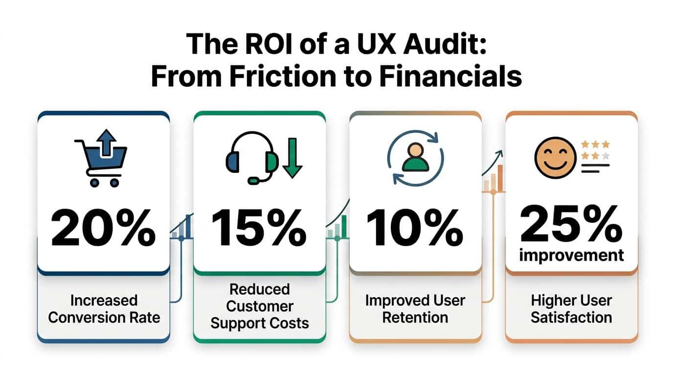
IBM reports that every $1 invested in UX can return up to $100, as summarized by Forrester. Teams do not need to hit that ceiling for the audit to pay off. They need clear evidence that a broken flow is suppressing conversion, inflating service cost, or delaying activation.
That is the shift a strong audit creates. It turns vague concern into a costed problem statement.
A checkout issue stops being "users seem hesitant." It becomes "shipping uncertainty and poor field validation are causing abandonment at the payment step." An onboarding problem stops being "the setup feels long." It becomes "users are reaching the third screen before they understand the product's value, so they exit before activation." In AI-enabled products, the same logic applies. If a recommendation module produces weak results, or a generative assistant burns tokens without improving task completion, the audit should tie that behavior to margin, retention, and engineering time.
Where the return shows up first
The financial impact of ux audit services usually appears in four places:
- Conversion improvement through cleaner sign-up, checkout, and activation flows
- Retention gains because users reach value faster and recover from errors more easily
- Lower support costs because the interface answers routine questions before a ticket gets opened
- Better delivery efficiency because product, design, and engineering teams fix root causes instead of debating symptoms
Product leaders and finance leaders often agree on UX work once the findings are framed correctly. Friction creates costs across acquisition, operations, and churn. The audit identifies where those costs start and which fixes are likely to pay back first.
What to measure after the audit
The best audits define success with operating metrics and then track them after release. That is especially important in modern products, where interface quality now overlaps with model quality, personalization logic, response speed, and AI operating cost.
A practical scorecard often includes:
| KPI | What the audit can influence |
|---|---|
| Conversion rate | Clearer flows, stronger hierarchy, fewer hesitation points |
| Task completion | Less friction in forms, setup, and repeat-use journeys |
| Retention | Faster time to value and less confusion after sign-up |
| Support volume | Fewer avoidable requests caused by unclear UX or weak self-service |
| Satisfaction signals | More trust, clarity, and confidence during key actions |
| AI feature efficiency | Better prompt design, lower wasted generation cost, and stronger output relevance |
For teams building the internal budget case, this guide to the ROI of your app or website is useful because it frames product investment in business terms instead of design language alone.
What usually fails to produce ROI
An audit does not create value by default. I have seen expensive audit decks produce almost no return because they described issues well but gave the team no practical path to fix them.
These patterns usually fail:
- Generic reports with obvious findings and no severity ranking
- Visual critique without flow analysis that ignores where users abandon, hesitate, or mistrust the product
- No implementation path from findings to sprint-ready tickets
- No product owner on the client side to carry recommendations into delivery
- Old audit models applied to AI features without reviewing prompt logic, response quality, fallback behavior, cost per interaction, or personalization accuracy
Audit value comes from fixing the right flaws in the right order.
That is what turns a UX audit from a research artifact into an operating tool that improves revenue, retention, and margin.
Example Audit Workflows for Different Industries
The workflow changes by industry because the risk changes by industry.
An ecommerce team usually wants to remove purchase friction. A fintech team needs clarity without sacrificing trust or compliance. A healthcare portal has to make sensitive tasks feel safe and understandable. A media product cares about discovery, engagement, and repeat visits.
The audit method stays structured, but the lens shifts.
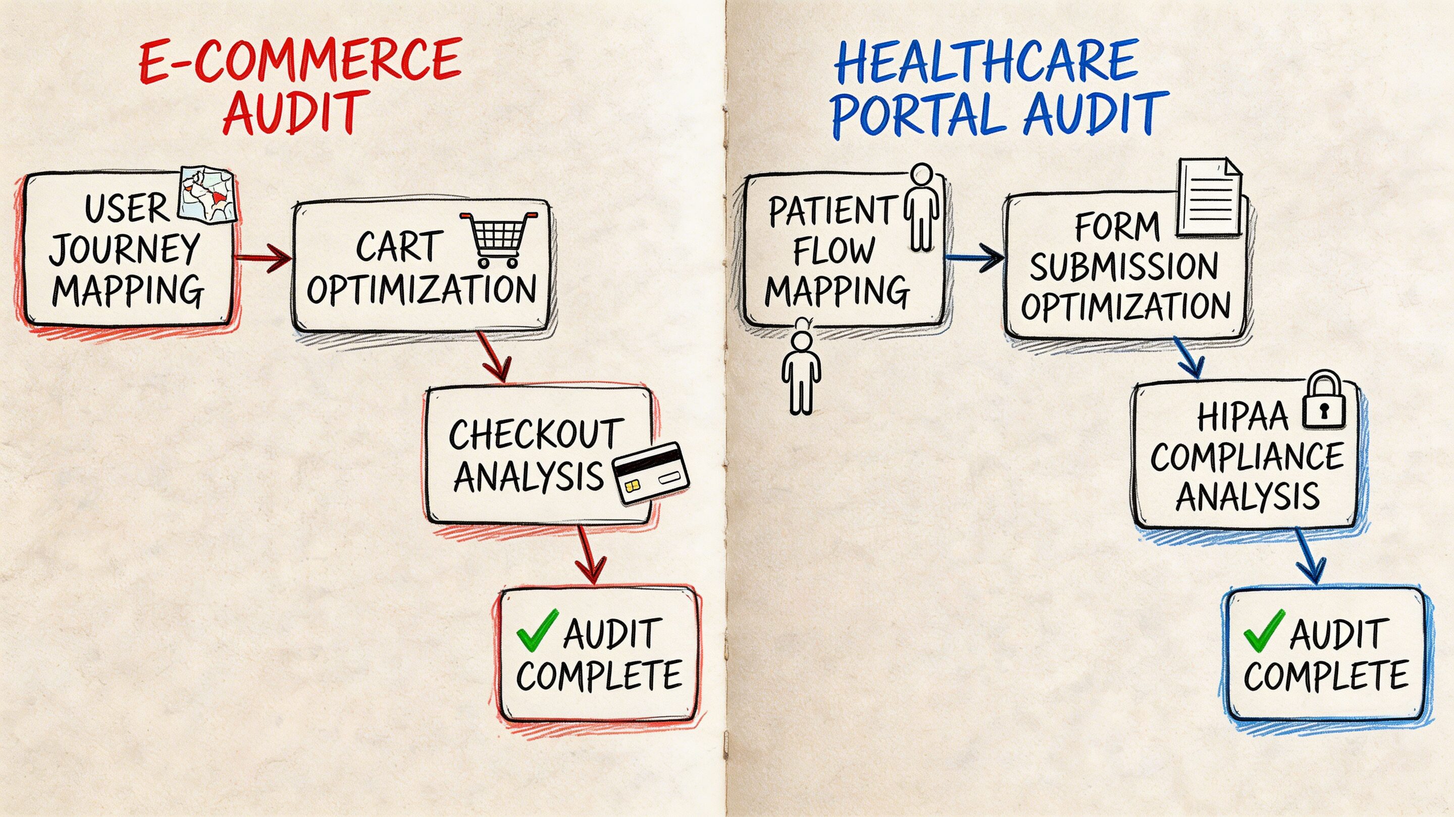
Ecommerce workflow
A typical ecommerce audit starts with the money path.
Auditors identify the highest-value journeys first: landing page to product detail, product detail to cart, cart to checkout, and post-purchase account flows. Then they compare what analytics suggests with what the interface asks the shopper to do.
Effective audits use quantitative-qualitative triangulation, combining analytics that show significant funnel drop-off with persona work to understand why, and they can reveal that mismatched user goals can lead to lower task completion rates, according to Uptop.
That matters in ecommerce because drop-off rarely comes from one cause. It may be a trust issue, a timing issue, a content issue, or a sequence issue.
A practical ecommerce workflow often looks like this:
Discovery review
Stakeholders define the revenue-critical flows, known complaints, seasonal constraints, and tech stack realities.Behavior analysis
Auditors inspect funnel exits, search behavior, category navigation, cart interaction, and mobile friction.Flow teardown
The team walks the full purchase path and marks moments where intent weakens.Prioritized report
Findings are grouped into quick wins, medium-effort fixes, and structural redesign candidates.
Fintech workflow
Fintech products create a different kind of friction. Users are often trying to make decisions that feel high stakes.
A workflow here usually centers on account setup, identity verification, funding, transaction review, statements, and support handoffs. The audit focuses heavily on clarity, confidence, and error prevention.
Common issues include:
- Dense screens that mix explanation, compliance language, and action controls
- Multi-step flows where users don’t know how long the process will take
- Unclear terminology that makes people hesitate before confirming a financial action
- Weak recovery states when a user enters invalid information or leaves a process midstream
In fintech, the best findings often come from reviewing where users pause, restart, or seek reassurance. A page can be technically complete and still create enough uncertainty to suppress completion.
Healthcare and patient portals
Healthcare UX has a trust burden that many products never face.
Patients may be scheduling care, reviewing records, handling forms, or accessing sensitive information while stressed, distracted, or unfamiliar with the system. In that context, an audit has to look beyond standard usability and inspect language, accessibility, hierarchy, and emotional load.
The workflow usually emphasizes:
| Focus area | Why it matters |
|---|---|
| Navigation clarity | Users need predictable paths for time-sensitive tasks |
| Accessibility review | Critical services must work for a wide range of users |
| Content comprehension | Medical or administrative language can easily overwhelm |
| Error handling | Confusing failures increase support burden and user anxiety |
Media and content platforms
Media apps usually don’t fail because content is weak. They fail because discovery is clumsy.
An audit here often examines browse patterns, recommendation surfaces, article or video transitions, sign-up interruptions, ad friction, and save or resume behaviors. The key question is whether the product helps users continue from one piece of content to the next.
A strong audit workflow follows the user’s real job, not the org chart behind the product.
What timelines usually feel like
The exact schedule depends on scope, but the sequence is consistent.
A lean audit may review one high-value flow and return a focused report quickly. A broader product audit usually needs enough time for discovery, evidence gathering, walkthroughs, synthesis, and working sessions with the client team.
What matters more than calendar length is discipline. If the scope is clear, the workflows are mapped, and the team knows which decisions the audit needs to inform, the output becomes far more useful.
How to Choose the Right UX Audit Partner
Your team has a conversion problem, support tickets are climbing, and the product still looks polished in demos. That is usually when companies start shopping for ux audit services.
The risk is choosing a partner that can describe UX well but cannot diagnose it well. That gap gets more expensive in products with personalization, recommendation logic, or AI-assisted flows, where surface-level reviews miss prompt behavior, model fallback issues, and hidden performance costs.
A strong audit partner brings judgment you can use in product planning. They know which problems are hurting revenue now, which ones are increasing churn risk, and which ones can wait because the engineering cost outweighs the likely return.
Look for diagnostic depth and modernization readiness
Good visual designers are not always good auditors. Good researchers are not always good at turning findings into a prioritized delivery plan.
The right partner usually shows strength in four areas:
- Method discipline so findings come from evidence, not taste
- Business framing so recommendations connect to conversion, retention, and support cost
- Technical awareness so fixes fit your stack, release process, and data constraints
- AI and personalization fluency so the team can review dynamic experiences, not just static screens
That last point matters more each quarter. If your product includes personalized content, AI search, guided recommendations, generated copy, or conversational support, ask how the audit accounts for prompt versioning, output consistency, latency, and cost-to-serve. Many firms still audit these products as if every user sees the same interface.
Questions worth asking before you sign
Good partner conversations get specific quickly.
Ask questions like these:
What inputs do you require?
Strong auditors ask for product goals, analytics access, support themes, known problem areas, release context, and technical constraints.How do you define severity and priority?
You need more than a list of issues. You need a ranking model that considers user impact, business impact, and effort.How do you connect findings to business outcomes?
Recommendations should explain what happens if the issue is fixed. Higher completion rate, fewer drop-offs, lower support volume, better retention.Will your report be implementation-ready?
Product, design, and engineering should all know what to do next without a separate translation step.How do you audit AI-driven or personalized experiences?
If the answer stays at the UI layer, the review is too shallow for modern products.What does a past finding look like?
A sample issue card shows whether the team writes with precision or hides behind vague language.
Ask to see one real recommendation with severity, evidence, business impact, and a suggested fix. That artifact tells you more than a credentials slide.
Understand pricing, but judge value by decision quality
Price matters. Direction matters more.
Audit fees vary because the work varies. A review of one onboarding flow is a different engagement from a product-wide diagnosis across acquisition, activation, retention, and account management. The best way to assess cost is to ask what decisions the audit will help your team make, how much evidence supports those decisions, and whether the output reduces wasted design and engineering effort.
A useful way to frame scope is:
| Audit scope | Best for | What to expect |
|---|---|---|
| Single-flow audit | One urgent conversion or onboarding problem | Fast diagnosis, focused recommendations |
| Multi-flow audit | Products with several linked friction points | Better prioritization across journeys |
| Full-product audit | Mature apps with broad UX debt or inconsistent patterns | Cross-functional roadmap and stronger alignment |
For budgeting context, Nielsen Norman Group's UX research pricing guidance is a better reference point than generic agency ranges because it shows how scope, methods, and team time change the cost.
Red flags that should make you pause
Some problems show up in the sales process.
Be cautious if a partner:
- Jumps to redesign concepts before diagnosing root causes
- Cannot explain their audit method clearly
- Treats every issue as equally important
- Focuses on aesthetics but avoids product metrics
- Ignores engineering constraints, data dependencies, or release realities
- Has no clear approach for AI-assisted, personalized, or dynamic experiences
The best ux audit services are usually the most precise. They show how they think, how they prioritize, and how their recommendations turn into measurable product gains.
Modernizing Your App The Next Generation of UX Audits
Traditional audits were built for static interfaces and predictable flows. Many products no longer fit that model.
When AI starts shaping the experience, the audit surface expands. You still need to inspect hierarchy, navigation, forms, states, and accessibility. But you also need to inspect what the system is deciding, generating, personalizing, and logging behind the scenes.
That’s where many teams get stuck.
Why old audit models miss new problems
A 2025 Gartner report notes that many ecommerce firms struggle with UX audits post-AI upgrades, and Google Trends shows a rise in searches for “AI UX audits”, as cited by Eleken. That gap is easy to understand.
Classic audit workflows can tell you whether a recommendation module is placed well on the page. They are less equipped to tell you whether the recommendation logic feels useful, whether prompt variation is creating inconsistent tone, whether generated outputs drift by user segment, or whether token spend is ballooning in the background while latency worsens.
An AI-enabled experience creates a second UX layer. Users feel it even when they can’t name it.
What a modern audit needs to inspect
For AI-powered products, the audit should include questions like these:
Prompt behavior
Are prompts versioned, tested, and reviewed when outputs change?Fallback logic
What happens when the model fails, hesitates, or returns weak output?Cost visibility
Can the team see cumulative spend tied to prompt usage and user flows?Interaction consistency
Does the assistant, recommendation engine, or generated UI behave consistently across devices and states?Governance and traceability
Can the team trace which prompt, model, and parameters shaped a user-visible response?
These aren’t edge concerns. They influence trust, usability, and unit economics at the same time.
Why prompt management is now UX infrastructure
A lot of teams still treat prompt management as an engineering detail. It isn’t.
If prompts drive onboarding help, search refinement, support responses, recommendations, or workflow guidance, then prompt quality is part of the user experience. So is prompt governance. So is the ability to compare versions, manage parameters safely, inspect logs across integrated models, and understand where AI usage is costing more than it should.
That’s why the tooling layer matters.
A serious AI modernization effort benefits from an administrative system that gives teams a prompt vault with versioning, a parameter manager for internal database access, a logging system across integrated AI tools, and a cost manager that surfaces cumulative spend. Without those controls, teams may ship AI features that look modern in demos but become opaque, expensive, and hard to optimize in production.
AI UX breaks down when nobody can explain why the system behaved the way it did.
What the next generation of ux audit services should deliver
The future-facing version of an audit should do more than critique the interface.
It should help teams answer four practical questions:
- Where is the user losing confidence?
- Which parts of that friction come from design versus AI behavior?
- What should be fixed in the interface, the flow, or the prompt layer first?
- How will the team monitor quality, cost, and consistency after launch?
That’s the shift. Modern UX work isn’t only about making software easy to use. It’s about making increasingly intelligent software understandable, governable, and durable.
Wonderment Apps helps teams modernize products that need more than surface-level UX fixes. If you’re upgrading an app with AI, personalization, or legacy system complexity, their team can help audit the experience, strengthen the underlying architecture, and operationalize the AI layer with prompt versioning, parameter controls, logging, and spend visibility. Explore what that looks like at Wonderment Apps.